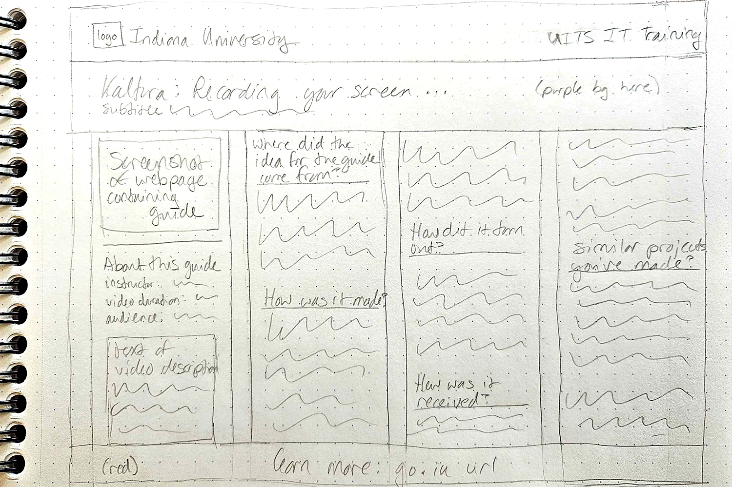
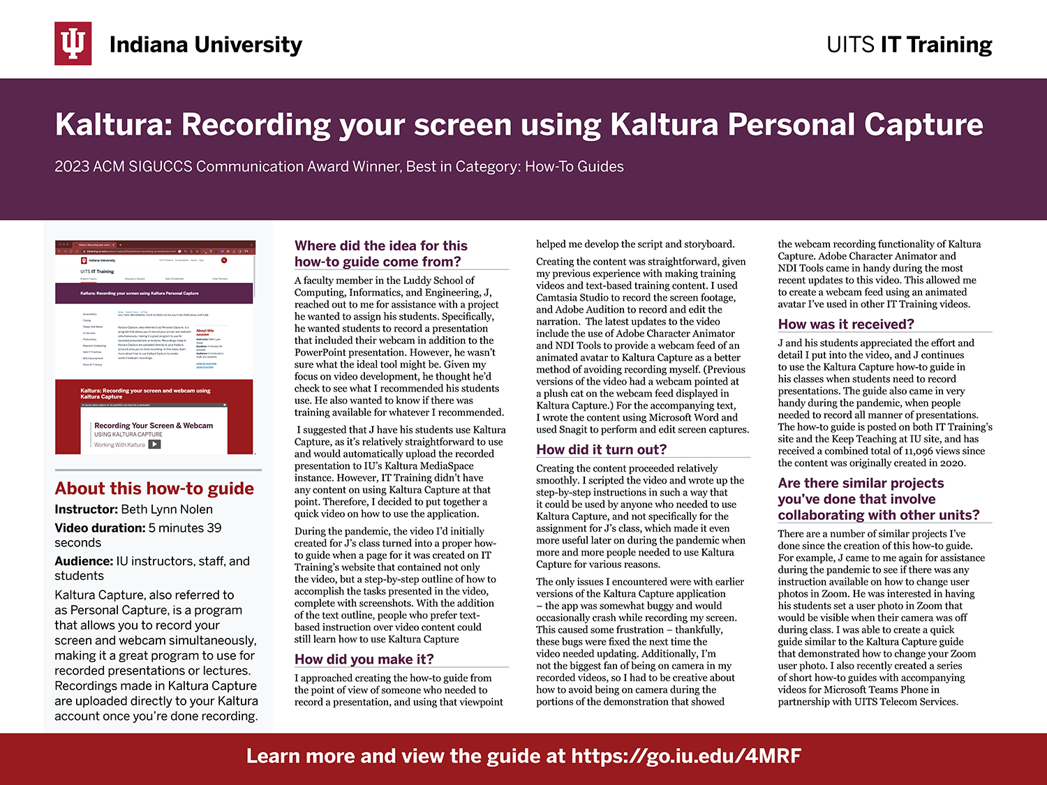
Once you’ve written your poster’s text and gathered the images you want to use, it's time to focus on planning the poster's layout — this includes choosing fonts and colors, and thinking about how the different elements of your poster will be laid out on the page. Determining these design details ahead of time can be helpful when you start creating the poster and adding content, as you won't need to make these decisions as you're attempting to lay out text and images.
Poster size
The size of your poster influences how much content you can include on the page, how large the items on your page will be, and how many images/graphics you can include. Knowing the poster size ahead of time will also help you determine where you can print your poster. Different poster printers have different maximum dimensions for printing, which is something you'll want to be aware of before you start designing your poster. Most conferences and poster competitions will indicate recommended sizes for posters – here are some common poster display board materials and sizes that will help you get started:
- Foam core display board: 18 x 24 in, 20 x 30 in, 24 x 36 in, and 30 x 40 in
- Cardboard trifold board: 36 in x 48 in
If you don't know what size your poster needs to be when you start creating it, 24 x 36 inches is a common poster size and a good place to start when desigining. If necessary, you can scale the poster up or down in size once you know for sure what size your poster needs to be.
Ensuring your poster is legible from a distance
It’s important to make sure your poster is readable from a distance — a poster’s size will influence how much content you can include while keeping the content legible. You'll want to ensure all the elements on your poster are large enough to be seen from a distance of 4-6 feet at the very least. One effective way to check to see if your poster can be read from a distance is to print out a copy of the poster on an 8.5 x 11 inch sheet of paper and examine the results. If you can still read the content when printed at that size, your poster will be able to be read from a distance.
Choosing fonts
Fonts are one place where you can set the tone for your poster, as certain fonts evoke different feelings. Some fonts come across as more professional, while others are seen as more informal. You might be wondering: How do I choose what fonts to use? What sort of fonts should be used for headings, and what fonts for body text?
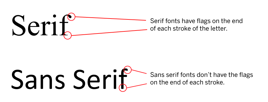
There are two main families of fonts to choose from when making a poster: serif and sans-serif. Serif refers to the flags at the end of the strokes that compose each letter, while sans-serif means the flags are absent. This can be seen in more detail in the following image:

Typically, serif fonts are used for body text, and sans-serif fonts are used for the poster's title and headings. Serif text is easier to read when used for long passages of small text, while sans-serif font is easier to read when it's used for larger text, such as headings and titles. Making use of fonts from the two different families helps add contrast to your poster, and makes the headings stand out from the surrounding body text.
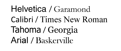
The following image shows some examples of sans-serif and serif fonts, paired together to demonstrate how they might look in a poster:

Make sure that the fonts you choose will be legible, especially from a distance, as people will be viewing your poster from a few feet away. If the font you've chosen is difficult to read from a distance, viewers might get frustrated and give up on reading your poster. In addition to choosing a font that's legible, you'll also want to make sure the size of the poster's text is appropriate for the different text elements that are present in your poster. Following is a table with suggested sizes for different text elements for a poster, to help guide you in the design process:


