Charts are an easy way to visually represent data and are good tools to use for conveying data to other users, including in presentations.
Charts in Google Sheets are dynamic and will automatically adjust if data in the worksheet is changed.
Charts are an easy way to visually represent data and are good tools to use for conveying data to other users, including in presentations.
Charts in Google Sheets are dynamic and will automatically adjust if data in the worksheet is changed.
If you are beginning this course at this point, you will need to copy the practice workbook to your Google Drive.
Right-Click Copy practice workbook, Click Open link in new window
The file begins to open in a new window of the web browser. Before the document will open and can be edited, we need to make a copy of it.
Move to the new browser window.
Click ![]()
A copy of the file is now open and, by default, is saved in your Google Drive. The filename now has the words "Copy of" at the beginning.
Let's create a pie chart to compare the number of items sold. Google Sheets makes it simple to create and format a chart.
To begin we will need to select the data we want to be included in the chart. In this case, the names of the items and the number of items sold (columns A and C). To select non-contiguous data in Google Sheets, we'll need to hold down the Control key while selecting the data.
Press & Drag A2:A6
Control key, Press & Drag C2:C6
The selected cells look like this:

Now we are ready to create a chart.
Click Insert, Click Chart
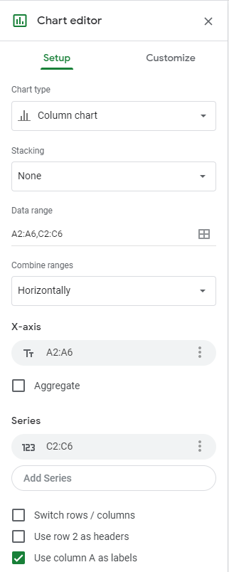
A column chart appears in the worksheet and the Chart editor panel opens:

While the default column chart accurately displays our data, we have several other chart type options. We can use the Setup options of this panel to change the chart type to pie chart.
Click ![]()
Click 
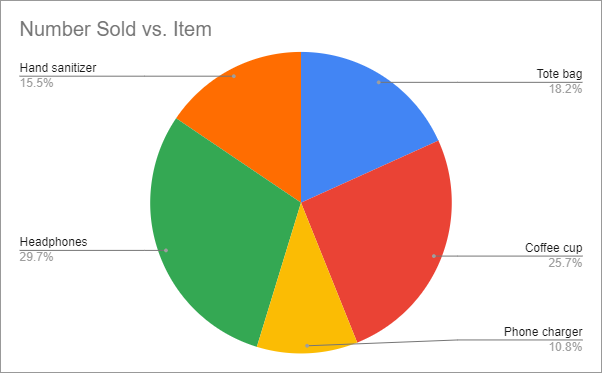
The chart looks like this:

The pie chart is showing each of the items as well as the percentage of the total each item represents.
Google Sheets makes it easy to modify a chart by using the Customize tab of the Chart editor panel. Let's add the total number of each item to the chart.
NOTE: If the Chart editor panel has closed, with the chart selected, Click ![]() , then Click Edit chart.
, then Click Edit chart.
Click ![]()
Click ![]()
Click  , Click Value
The number, or value, of each item, has been added to each slice of the pie. Using the options in the Chart editor panel, we could change the font, size, format, or color of these labels. For now, we'll leave them as they are.
The pie chart may be covering part of the data in the worksheet. If so, it is easy to move the chart to another area.
Press & Drag the pie chart below the data
Click a blank area of the worksheet
The chart is now positioned below the data and the data is fully visible.
Graphics, including images and charts, should be given alternative text. This is the text that screen reading software will read aloud to a user who may not be able to see the image. This text should be clear and descriptive and should give the reader an accurate idea of what the graphic conveys. This is especially important when the graphic contains content that is essential to understanding the data.
Click the chart
Click  , Click Alt text
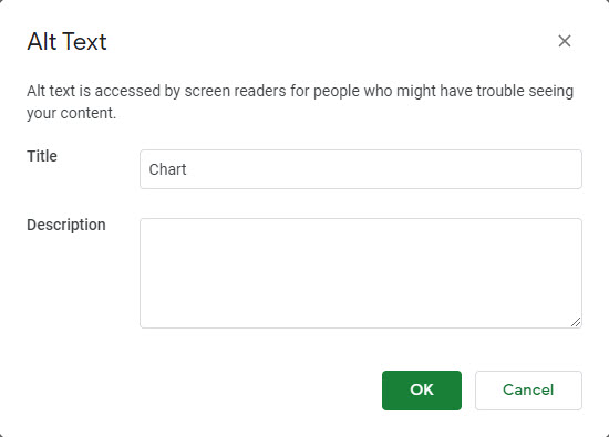
The Alt Text dialog box opens:

Using this dialog box, we can add a title as well as a description.
Click in the Title field
Number sold vs. item pie chart
Click in the Description field
Pie chart describing the percentage of sales by item. Hand sanitizer is 14 percent, tote bags are 16 percent, coffee cups are 23 percent, phone chargers are 21 percent, and headphones are 26 percent.
Click ![]()
The alternative text is applied and our worksheet is now accessible to people who utilize screen reading software.