A chart is a graphical representation of data in a worksheet. A chart can help users make some sense of the data. When creating a chart from data in a pivot table, most elements, such as categories, data series, and axes, work the same as in standard charts created from a dataset. However, the chart will reflect any filtering that is applied to the pivot table.
Copying the practice workbook
If you are beginning this course at this point, you will need to copy the practice workbook to your Google Drive.
- To begin copying the practice workbook in a new browser window,
Right-Click Copy practice workbook, Click Open link in new window
The file begins to open in a new window of the web browser. Before the document will open and can be edited, we need to make a copy of it.
Move to the new browser window.
- To copy the workbook file, in the browser window,
Click ![]()
A copy of the file is now open and, by default, is saved in your Google Drive. The filename now has the words "Copy of" at the beginning.
Before we can create a chart, we need to build the pivot table. We will use the data in the Orders worksheet.
Let's create a pivot table that shows us the number of orders by store category and store name.
- Move to the Orders worksheet.
- To begin creating the pivot table, on the menu bar,
Click Insert, Click Pivot table
- To accept the range and placement and to place the pivot table in a new worksheet, in the Create pivot table dialog box,
Click

- To name the new pivot table worksheet,
Double-Click the new worksheet tab, type: OrdersByCategory Enter key
With the new worksheet created and named, we're ready to add fields to the pivot table. We will add the Store Category, Store Name, and Quantity Ordered fields.
- To add the Store Category field to the Rows area,
Press & Drag the Store Category field to the Rows area
- To add the Store Name field to the Rows area,
Press & Drag the Store Name field to the Rows area
- To add the Quantity Ordered field to the Values area,
Press & Drag the Quantity Ordered field to the Values area
With the pivot table created, we can now insert a chart.
We'll create a chart that shows us the orders for each store. We will then filter the data to see specific store categories.
When creating a chart from a pivot table, it is a good idea to remove the totals from the pivot table. If these totals are included in the chart, the chart won't be an accurate representation of the data.
- To select the data to be included in the chart, in the pivot table,
Press & Drag B1:C29
- To insert a chart, on the menu bar,
Click Insert, Click Chart
The chart appears in the worksheet. Depending on the last chart type used by Google Sheets, this new chart may be a pie, column, line, or another type of chart. We want this to be a column chart.
With the addition of the chart, the Chart editor also appeared on the right side of the worksheet.
- To change the chart to a Column chart, if necessary, in the Chart editor,
Click
 , Click
The Column chart appears in the worksheet:

Before we begin working with the chart, let's move and resize it.
- To move the chart,
Press & Drag the chart to a blank area of the worksheet
- To make the chart larger,
Press & Drag the lower right resize handle
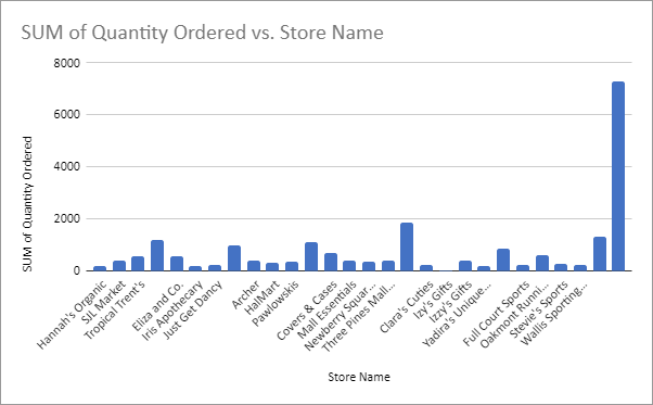
On the far right of the chart is a column that is much larger than the others. In addition, it isn't labeled. This is the Grand Total, 7279. We created the chart using the range B1:C29. This range included the total but did not include the label "Grand Total" which is in cell A29.
A closer look at the chart shows other unlabeled, larger columns throughout the chart. These are the totals for each category.
We don't want any of these totals in our chart. We can remove them by removing totals from the pivot table.
- To see the Pivot table editor, if necessary,
Click in the pivot table
- To remove the Grand Total, in the Store Category field,
Click

- To remove the store totals, in the Store Name field,
Click

Now that the chart is showing accurate data, let's use a filter to see just the Online store category.
- To see the Pivot table editor, if necessary,
Click in the pivot table
- To add the Store Category field to the Filters area,
Press & Drag the Store Category field to the Filters area
- To see the filter options, in the Store Category field,
Click

- To clear all of the current selections,
Click Clear
- To see only the Online store category,
Click Online store, Click

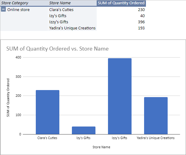
The pivot table and the chart both adjust to show just the online stores.

Updating a pivot table
The pivot table and the chart are not only linked to each other, but they are also both linked to the source data.
Look closely at the stores in the online store category. There are two stores with very similar names. One of these, Izy's Gifts, was entered into the source data incorrectly. We can correct this misspelling in the source data. When the pivot table is refreshed, the data will be corrected there as well.
- To move to the source data worksheet,
Click the Orders worksheet tab
- To open the Find and replace dialog box, on the keyboard, press:
Control key + H
- To find the misspelled entry, in the Find field, type:
Izy's
- To replace the occurrence of Izy's with Izzy's, in the Replace with field, type:
Izzy's
- To replace all occurrences of Izy's,
Click

- To replace the misspelling in all sheets,
Click

- To close the Find and replace dialog box,
Click

Let's return to the OrdersByCategory worksheet to see the updated pivot table and chart.
- To return to the OrdersByCategory worksheet,
Click the OrdersByCategory worksheet tab
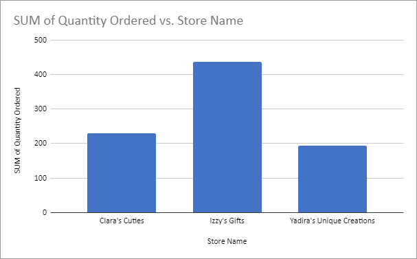
Both the pivot table and the chart have been adjusted. The entry for Izy's has been removed and the number of orders for Izzy's has increased.


