Charts can be a very useful tool to use in a presentation. However, Google Slides is not the primary program used when working with charts. Google Sheets is used to create and edit charts. We will be going over the very basics of how to insert a chart into a Google Slides presentation in this lesson.
Copying the practice presentation
If you are beginning this course at this point, you will need to copy the presentation to your Google Drive.
NOTE: If you have been working through the course, your file should be up to date and you will not need to copy the practice presentation. You can move ahead to Inserting a chart from Google Sheets.
- To begin copying the practice presentation in a new browser window,
Right-click Copy practice presentation, Click Open link in new window
The file begins to open in a new window of the web browser. Before the presentation will open and can be edited, we need to make a copy of it.
Move to the new browser window.
- To copy the presentation file, in the browser window,
Click ![]()
A copy of the file is now open and, by default, is saved in your Google Drive. The filename now has the words "Copy of" at the beginning.
Copying a file from Google Sheets
For the purpose of this lesson, a chart has already been created in Google Sheets and saved in a file titled, "Data for Charts." We will insert this chart into our Slides presentation, but first we will need to copy the file to our Google Drive.
- To copy the Google Sheets file, click the following button:
The file begins to open in a web browser. Before the spreadsheet will open and can be edited, we need to make a copy of it.
- To copy the file,
Click

A copy of the file is now open and, by default, is saved in your Google Drive. The filename now has the words "Copy of" at the beginning.
The Google Sheets file is now open. We will modify this spreadsheet in a moment. But for now, we need to return to our Slides presentation.
- To return to the Slides presentation, at the top of your browser window,
Click the tab labeled "Copy of Google Slides: The Basics 2"
Inserting a chart from Google Sheets
Now that the Sheets file has been copied, we are ready to insert the chart into our presentation.
- To select the correct slide, in the Slide panel,
Click the slide titled "Chart showing three students' academic progress in their first year of college."
- To open the Insert Chart dialog box, in the menu bar,
Click Insert, Click Chart, Click From Sheets
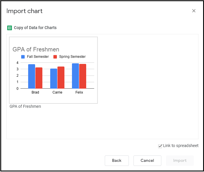
The chart we want to insert, "GPA of Freshmen" is saved in a file titled "Data for Charts."
- To select the correct file,
Double-click the file titled "Copy of Data for charts"
The dialog box changes and is now the Import chart dialog box:

The chart we want to insert is available in this file. Notice the checkbox labeled "Link to spreadsheet." By linking a chart to the original spreadsheet, we ensure that any changes made to the data in Google Sheets will be reflected in the chart we are inserting into Google Slides. While this feature can often be helpful, there may be times we don't want the chart in our presenatation to change. If this is the case, simply uncheck the box before importing the chart.
Let's import the chart now.
- To select the chart to import,
Click the chart titled "GPA of Freshmen"
- To import the chart,
Click

Modifying a linked chart
When we imported this chart, we chose to link it to the original spreadsheet. Because of this, any changes made to the data in the spreadsheet will be reflected in the chart in our Google Slides presentation. Let's see how this works.
We'll begin by opening the source spreadsheet.
- To open the source spreadsheet, on the chart,
Click
 , Click Open source
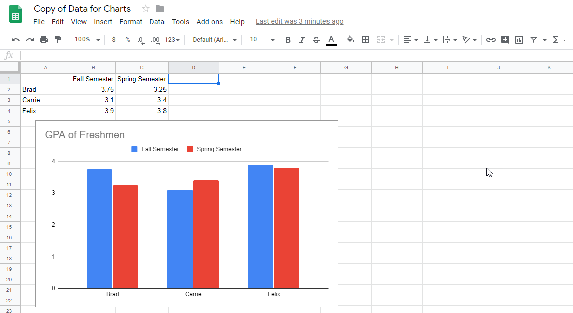
Google Sheets opens. There is a simple spreadsheet showing the fall and spring GPAs of three students and the same chart we previously inserted into our slide show.

Any changes made to the data in the spreadsheet will be reflected in the chart, both in Sheets and in Slides.
- To select the data to be changed,
Click in cell C2 (the cell showing Brad's spring semester GPA, 3.25)
- To change the data, type:
3.85 Enter
When you pressed Enter, the new value was accepted and reflected in the chart. Brad's two semesters are now much closer than they were.
Let's see what happened to the chart in our Google Slides presentation.
- To close Google Sheets,
close the browser tab
- To update the chart, in the upper right corner of the chart,
Click

The chart updates and reflects the new source data.
Adding alternative text to a chart
As with the other graphic elements (images, shapes, photos, etc.) in a presentation, it is necessary to include alternative text for a chart. The process for this is similar to adding alt text for other elements.
- To open the Alt Text dialog box,
Right-Click the chart, Click Alt text
The dialog box opens. Remember whatever we put in the description field will be read out loud by a screen reading program. Therefore, we want to add a helpful and detailed description of the chart.
- To add a detailed description, type:
Chart showing three students and their fall and spring GPAs. Brad's fall GPA was 3.75 and his spring GPA was 3.25. Carrie's Spring GPA was 3.1 and her spring GPA was 3.4. Felix's fall GPA was 3.9 and his spring GPA was 3.8.
- To accept this description,
Click

Formatting a chart
Charts can be moved, aligned, resized, and recolored within Google Slides. Let's center this chart and then adjust the border.
- To select the chart, if necessary,
Click the chart
- To center the chart horizontally, on the menu bar,
Click Arrange, Click Center on page, Click Horizontally
The chart is now centered on the slide. Let's take some time to adjust the color and weight of the border.
- To change the color of the chart border, on the toolbar,
Click
 , Click any theme color
Depending on the color you chose, you may not see much difference in the chart. If we adjust the weight, or thickness, of the border line, the change will be more obvious.
- To adjust the weight of the border to four pixels, on the toolbar,
Click
 , Click 4px
- To deselect the chart,
Click in a blank area of the slide
The border is much thicker.
Borders can be added to and adjusted for many of the graphic elements we put in a presenation. You can experiment with adding a border to an image or shape.

