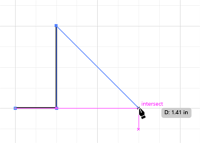
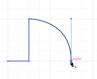
Now that we have a document we lay out a floor plan in, we can start creating elements to add to it.
Before we start, let’s take a quick look at this example floor plan from the book Visual Merchandising and Display by Martin M. Pegler and Anne Kong:
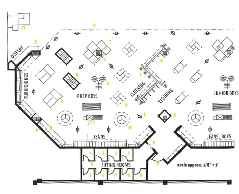
If we look at this floor plan and focus on the shapes that make it up, rather than what each element represents, we’ll see a lot of shapes and design elements that we can easily make in Illustrator. In fact, everything we see here can be made using the Shape tools and the Pen tool. We can modify the appearance of shapes and lines in order to represent specific types of elements, too.
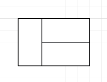
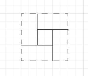
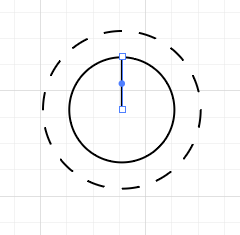
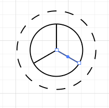
Let’s practice making a couple of commonly used floor plan elements: a table cluster, quad rack, round rack, and a doorway, as shown in the following graphic:
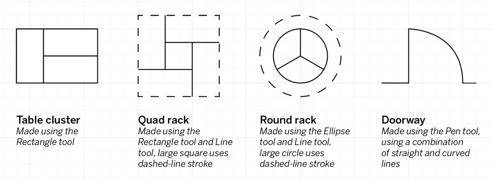
As you can see, the graphic lists what tools we'll be using to create each element. All of the tools we'll use today are ones we've already used in the previous session.
If desired, you can open the file Floor plan practice.ai to follow along with the demonstration, so you can see what the floor plan elements should look like when they're finished. Additionally, it may also help to turn on the Snap to Grid feature of Illustrator, to help ensure the floor plan elements are precisely the size we need them to be.
NOTE: The following steps assume you have downloaded and extracted the exercise files to your computer’s desktop. If this isn’t the case, navigate to the location where you extracted the exercise files instead of the desktop.


