Paying attention to detail is critical when designing a publication, to ensure it looks its best. There are two main areas we'll want to focus on: typographic details and alignment details.
Typograhphic details
As we're paying attention to detail in our layouts, typographic detail is one of the main areas we’ll want to focus on as we’re building a publication. There are lots of typographic technicalities we’ll have to pay attention to, including different types of fonts, spacing, alignment, and more.
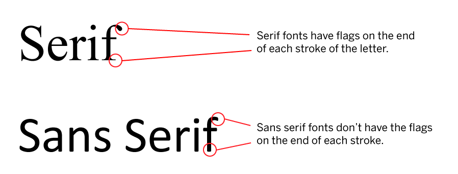
First, let’s talk about fonts. There are two main font families: serif and sans serif. Serifs are the small embellishments at the end of the stroke in a letter – if a font has these embellishments, then it’s referred to as a serif font – if it lacks them, then it’s referred to as sans serif. The following diagram shows this difference:
We can make use of both serif and sans serif fonts in our layouts. Serif font is typically used for body text in print, especially for large amounts of text, as serif fonts are often considered easier to read when used for long passages of text. For digital documents, however, sans serif is often used for body text. No matter what font family you work with for body text, you should ensure you’re using a font that’s easy to read – avoid using more ornate fonts for body text, as it will make the text more difficult to read.
Combining serif and sans serif fonts can help add variety to our text. Using a serif font for body text with a sans serif font for subheads can add a little contrast to our text, and make our subheads stand out more, for example.
Spacing is another typographic area we’ll need to pay attention to. We can adjust the spacing of our type in a number of different ways to change the appearance of our text and improve readability, if necessary. First, we can adjust the space between all letters in a word by adjusting the tracking. This can be used to help bring letters closer together in a headline, for example. Tighter tracking, or less space between letters, works well for larger font sizes, while the default tracking value for a font is good for body text. Following are some examples of different tracking values, to better illustrate how tracking works:
![]()
We can also adjust the spacing between two letters, as opposed to all letters in a word – when we’re changing the spacing between two letters, that’s referred to as kerning. This can especially be useful when there are two letters with an awkward amount of space between two letters, like the letters A and V, or an uppercase T and a lowercase e. Take a look at the following example to see kerning in action:

If you look closely at the examples with tracking adjustments, you can see that the letters T and e in Teacher are closer together than in the example with no adjustments. The A and V in AV are also pushed closer together, removing some unnecessary awkward space between the two letters.
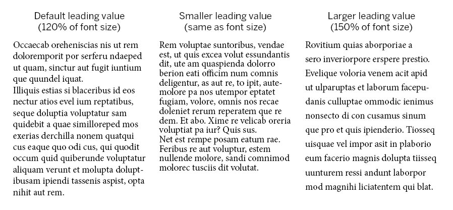
Another place to pay attention to spacing is between lines of text – that’s referred to as leading. When working with leading, we’ll want to think about where the text is in our document, and ensure that the leading adjustments we make don’t make it difficult to find our next line of text. Typically, page layout programs set the leading automatically to 120% of the font size, but we can adjust that as need be. Sometimes, a smaller leading value than the default will make it easier to make it to the next line of text in small columns of body text. You’ll want to experiment with leading values, though, to find what works best for your publication.
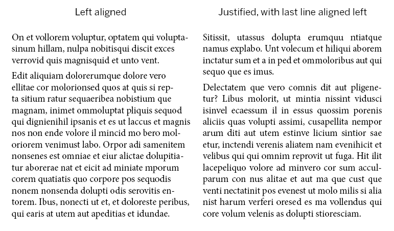
Next, we’ll take a look at paragraph alignment. There are two main ways of aligning paragraphs: using full justification or left alignment. Both alignment methods create a different feeling – full justification can be seen as a little more formal, while left alignment might be seen as a little more relaxed. There aren’t any hard and fast rules about what alignment should be used in specific situations; you may want to experiment with both types to see which works best for your layout.
Depending on the type of publication you’re working on, you may be incorporating headlines of some sort into your layout. If you are using headlines or headings in your document, ensure that they’re large enough to be easily read and in a typeface that’s easy to read. If you’re including your headline over an image, make sure that your text can be read over the top of the image, too.
Another typographic area to pay attention to is how type can be used to bring a reader into a story with different layout techniques. We can use a kicker (typically a few words above the headline of an article or story) or a deck (also sometimes called a lead-in, a sentence or two summarizing the story) to help catch our reader’s attention and get them interested in our message.
The last – but certainly not least! – area we’ll need to pay attention to is the proofreading process. Making sure a document is free of grammatical and spelling errors is essential to ensuring we have an outstanding publication. If possible, set your finished layout aside for a bit and come back to it later with fresh eyes, so you’ll be better able to see any errors in the text that might not have been noticed previously. You may also want to ask someone who’s not involved in the project to check over your layout and proofread it for you, to ensure it’s in good shape.
Alignment Detail
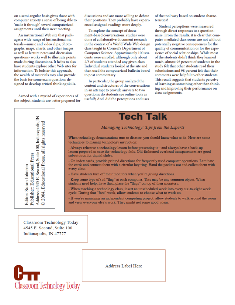
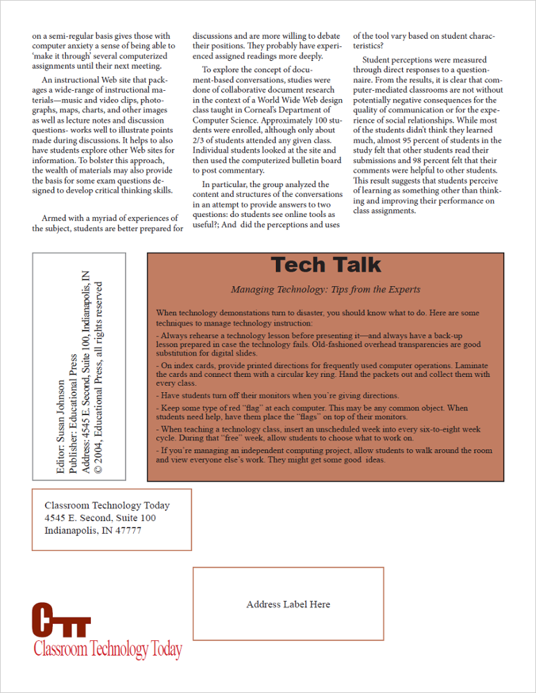
Alignment is the most important layout detail we need to pay attention to. Making sure our page elements are aligned properly will make the difference between an amateur publication and one that has a more professional look and feel. Readers may not necessarily notice good alignment, but they will notice bad alignment. Let’s look at some specific areas where we’ll want to pay attention to alignment.
First, we’ll want to make sure our text elements are aligned – misaligned text elements look unprofessional and break up the document's flow. The places where misaligned text elements are most obvious are at the top and bottom of columns of text, or where headlines are positioned over columns of text on a page.
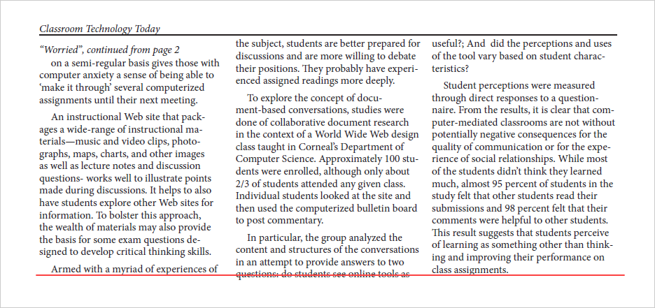
In the previous example, you can see the red line across the bottom of the page, showing that the columns of text end at different points on the page. Making sure our text elements are in alignment with each other will ensure our publication looks its best.
We’ll also want to make sure that graphical elements, such as text boxes, images, and other elements on the page, are aligned with each other. Misaligned elements on a page can look messy, and can also distract people from the message you’re trying to communicate. Take a look at the following examples to see the difference proper alignment will make in a layout.


