Making page elements stand out from each other
Contrast is what adds the most visual excitement to a page. When we're talking about contrast in page design terms, we're thinking about adding elements that are eye-catching and will draw the reader into our publication. We want to encourage readers to look at our content, and we can do that by adding some contrast to our page.
When working on incorporating contrast into a page, we can think about the various page elements falling into one of three categories: black space, white space, or gray space.
- Black space consists of headings, artistically rendered text (also referred to as display type), pull quotes, photos and illustrations, swatches of color - this is the first place viewer looks
- White space is the blank space between text blocks and around other elements in a page – this is the second place a viewer looks
- Gray space refers to body text, which is the last place a viewer looks
In other words, our eyes tend to go towards the most exciting or attention-getting elements on the page first (black space), then to the empty spaces, and then to the body text (gray space) - where we then realize we'll need to process information that's contained in that text. If our gray space isn't broken up well with white and black space, readers may try to actively avoid our gray spaces because they could be intimidated by the amount of text they're about to read. Our goal as designers is to make our page as inviting as possible - and we can do this by adding some contrast to our page in order to make it more visually appealing. As we design, we'll want to keep in mind how our viewer's eyes are attracted to different parts of the page with black, white, and gray space. Ask yourself if the content is intended to be read carefully. You would be inclined to include more black and white space in a horror movie or paintball publication than an in-depth news analysis.
Following are some examples of black, white, and gray space as they might be laid out in different types of publications.
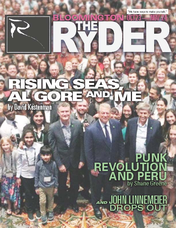
Example 1

This example, a magazine cover, consists solely of black space - what with the photograph in the background and the text with drop-shadows, nothing here can really be classified as gray space or white space. Is there anything that you would do differently, if you were making a cover for a magazine similar to this one?
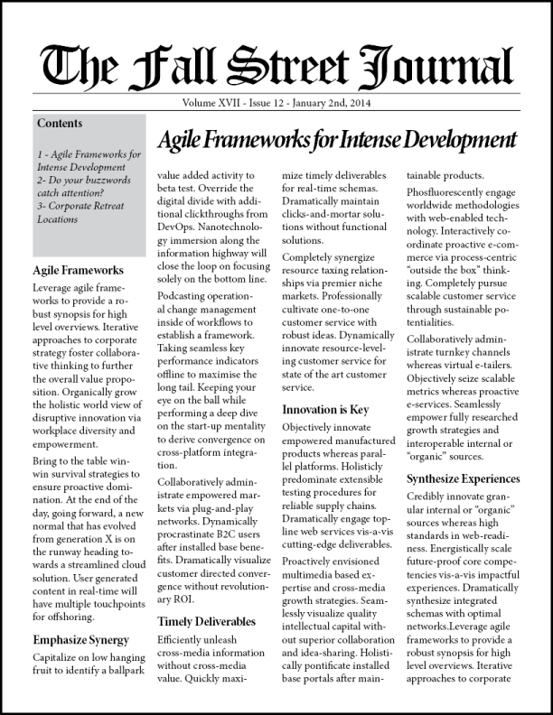
Example 2

This example, a demonstration page similar to that of the front of a newspaper or newsletter, is composed of almost entirely gray space, with only a little white and black space mixed in. When readers approach this page, they may be actively turned away from it due to the overwhelming amount of text on the page. How could you change this page to make it more inviting to the intended audience?
Example 3

This example has a mix of black space, white space, and gray space - you can see that the gray space is broken up with small spots of black space. The body text being broken up with the blue subheads is an effective way to add some contrast to a large chunk of text, and the white space helps break up the page a bit as well.
Now that we've seen some examples of black, white, and gray space, let's think about how we can use these different types of space to add some contrast to a page.
How can we use contrast in a publication?
We've seen some examples of white, black, and gray space combined on a page - let's take a look at another example, something that you might find in a newspaper.

When looking at this page, think about the following:
- Where do our eyes go when we look at this page?
- What do you think is the most important article?
- Is it clear where each article ends and begins?
- Are there places where contrast would help make this collection of articles easier to read?
When we're creating a layout, there are many ways to add contrast to a page to make specific elements or sections of the page stand out from each other. Using the different types of spaces we've explored and thinking in black, white, and gray space can help us with this! Many of the methods of adding contrast that are outlined in the following list can involve working with multiple types of space at the same time - so feel free to experiment with some of these techniques and see what works best for your layout.
Methods of implementing contrast in your layout

This demonstrates one way we could add some contrast to the previously shown newspaper layout.
- Borders between elements: Borders between different elements on the page that aren't related to each other can help emphasize that the two elements are separate. One example: separating the newspaper articles with a border could help fix the Environmental Policy example we explored earlier.
- Color: There are many different ways we could incorporate color into our layout to help add some contrast. We could add a colored background to an element, or a colored border, or add color to text. Adding color is a simple way to add some contrast to a page element!
- Images: Incorporating some images into your text could help add some contrast and break up a page a little bit more, as well as add some visual interest to your page.
- Decorative text/display type: Artistically rendered text can help add some contrast - especially to titles or headings. Giving your most important text a different appearance than the rest of your body text can really help it stand out. You’ll want to make sure your chosen display type matches the tone of the publication.
- Different fonts or text sizes: Using a different font, or a different font size than the surrounding text, can help call attention to a specific idea or section of the page and add some contrast to an item.
- Subheads can also be used to add a little bit of contrast when it comes to body text. They can add a little pop of color or variety in font style, and break up a large chunk of body text by topic or section – which can help make our page a little more inviting to our readers. Subheads are also important when navigating through a document – we’ll talk more about this in a later section.
- One important way to add contrast is to make sure to include appropriate space between columns of text, images, and other page elements. This can help readers determine where one section ends and another begins, and can also give readers a chance to rest their eyes.
Contrast: Summing it up
Here’s a brief review of what we’ve learned about contrast:
- Contrast is used to help add visual interest to a page
- Contrast can be thought of as how three different types of space – black, white, and gray space – are laid out on a page together
- There are many different ways to make use of contrast on a page to help call attention to specific parts of a layout, including (but not limited to) the following:
- Incorporating color
- Adding borders between page elements
- Breaking up text with images or subheads
- Using decorative text, different fonts, and different sized fonts
For further information and examples of contrast in design, check out the following links:
- The Principles of Graphic Design: How to use Contrast Effectively
- Contrast principle of Graphic Design (video)
- Principles of Design: Contrast (video)
Now that we’ve got a better idea of what contrast is and how to make use of this principle in our layouts, let’s move on to another layout principle: proportion.

