Leading readers through the page
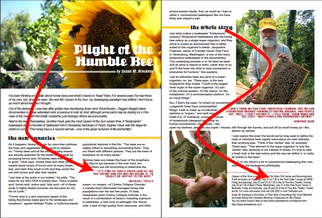
The principle of direction focuses on clarifying the flow of the document, and being aware of how the elements on the page draw the reader's eye through the content, as well as where a reader’s eye goes on the page.
Think back to when we were exploring the use of contrast - and specifically black, white, and gray space in a publication. We can use these different types of spaces to help lead a reader through our page, by catching their eye and drawing it through the page in a specific direction. When we thoughtfully lay out the black and white space on our page, and use those types of page elements to help break up the gray space, we can lead the reader through our page and make the gray space more inviting to a reader.
How we lay out items and lead a reader through a page can be influenced by any number of things, including the following:
What type of document it is: Is this going to be a book, a brochure, a newsletter, or a digital file? Depending on the type of document, there may be certain limitations on how we can lay out our page elements based on how our document might be physically constructed in its final version. For example, if we’re designing a book, we’ll need to be aware of where the central binding is, and be careful of placing elements over that binding so we don’t accidentally lose important information where the book is bound. With a digital magazine, there aren’t necessarily any physical constraints on page size, but we might want to think about how a publication would look if someone were to print it out.
Page size and orientation: What size is our page going to be, and how will the page be oriented? Will it be a portrait or landscape orientation? This may be decided by the type of document we’re creating, or how and where the item is being displayed. A poster, for example, might be created with specific printing dimensions and a landscape orientation so it can fit into a frame or display case. Digital documents aren’t immune to page size and orientation decisions, either – while digital documents can easily be resized on a screen to fit, we may want to think about the document’s eventual destination and design it accordingly. Will your document be mainly viewed on a desktop computer, or a mobile device? This can affect the size of our pages, and how we orient them as well.
If, and how, the document is folded: This can again be based on what type of document it is, how the document is being displayed, as well as whether or not whether or not it's going to be mailed. There are many different ways of folding a document, and that depends on the type of document as well. The folds of a document can help structure a document – if we were creating a trifold brochure, we might use each third of the page as an individual column, or create an asymmetrical layout that has a large section of text occupying two thirds of the page, and other elements occupying the other third of the page.
Column layout on the page: Different column layouts can affect how we lead a reader through a page with black, white, and gray space – there are many different types of column layouts, and some work better than others in specific contexts to help set a specific tone. Again, remember your audience and your message – we want to choose a column layout that'll fit the tone of the publication! We can break up our page into sections of different column widths, too – for example, two thirds of the page could have a 3 column layout, while the other 1/3rd of the page could have a one-column layout, breaking up our page into some modular vertical and horizontal zones.
How we arrange the items on a page: As we place elements on our page, we can arrange them in certain ways to give our readers visual "stepping stones", which will draw their eye through the contents of our page. You'll want to think about arranging elements like images, colored text boxes, titles/headlines, and other eye-catching elements in different ways in order to draw the reader into the publication.
Now that we’ve learned about the different things that affect how we can lay items out on a page, let’s learn about how we can make use of the principle of direction in our publications to effectively lead a viewer through our document.
How can we use direction in a publication?
One of the easiest ways to lead our reader through a page is by being conscious of where we put our different page elements, and try to create certain paths through the document with these elements. These paths can be diagonal lines in any direction, or shapes like a C or a Z. Following are examples of the C shape and Z shape:
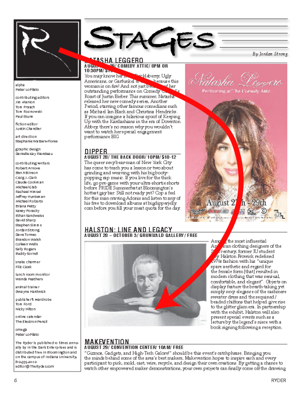
This is an inverted version of the c-shape, and it still leads readers through the page in an effective way.
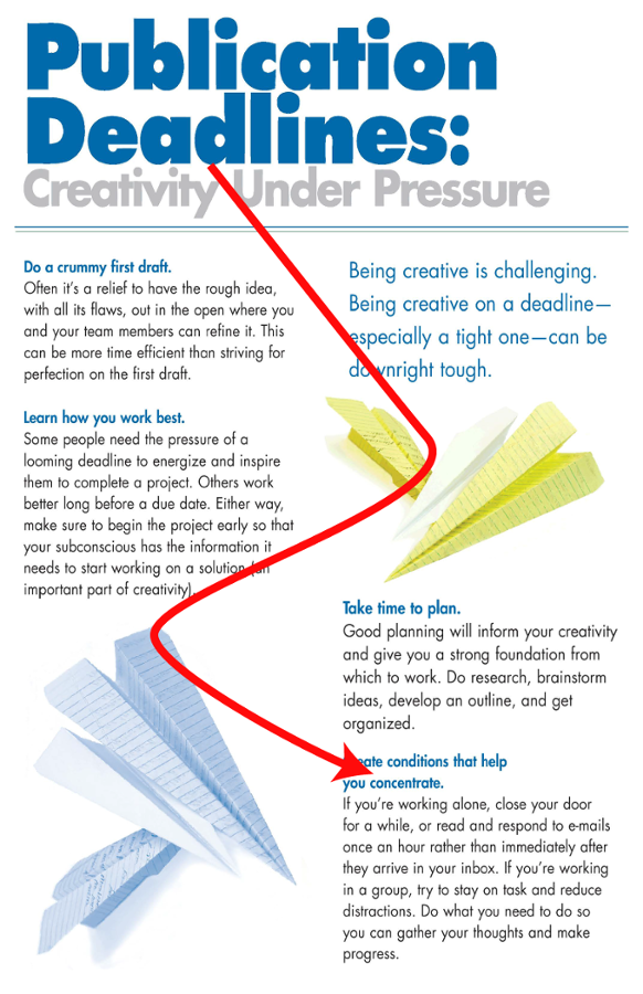
The z-shape in this example makes use of images and text to lead a reader through the page.
As we’re laying out these elements, we’ll want to be conscious of how balanced our page is – we don’t want to trap our readers in one corner of the page, so to speak, or have one section of the page that’s a little more heavy, graphic or text wise, than another. An easy way to check and see how a layout is balanced is to simply draw lines across the page or spread – and see if there are any sections that have a little too much white, black, or gray space compared to the others. Following is an example of a page broken down into quarters - do you think that this page is well balanced?
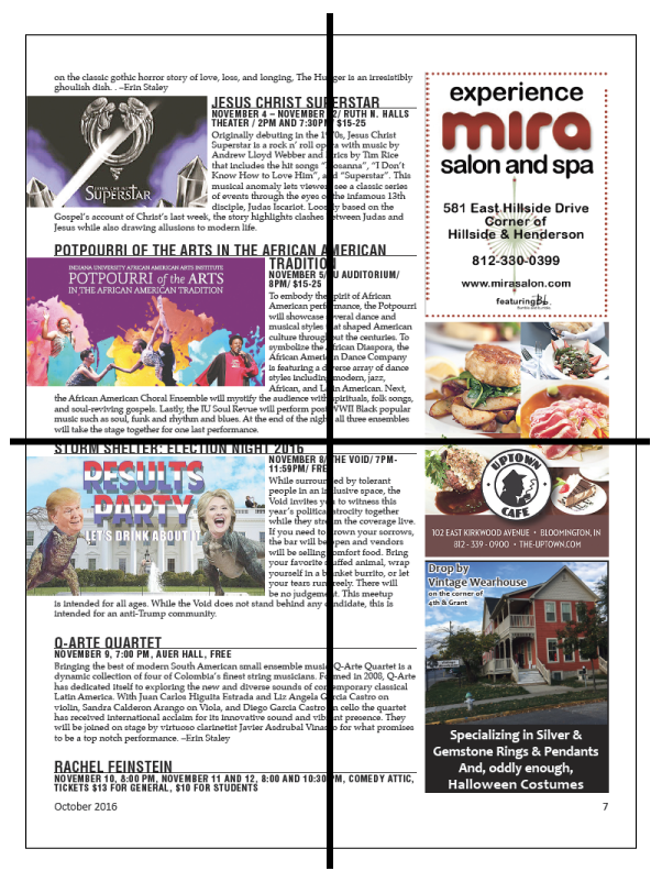
Shapes to avoid when laying out items
When attempting to lay out items in specific paths or shapes, there are a couple of different shapes you'll want to use with caution: the X and O shapes. Each of these shapes can be attractive to use in a publication, but can also end up being confusing for our readers.
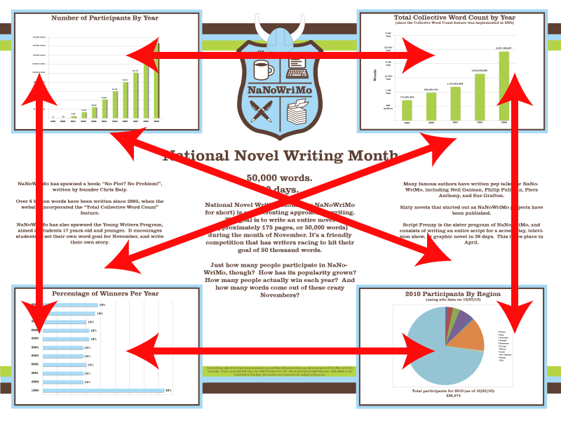
Having our eye-catching elements arranged in an X layout can make it hard for a viewer to figure out where to start on our page, and where to go next. (The featured example is one belonging to one of the authors, created as a class assignment before realizing the X layout might not be the best one to use!) The X design also isolates elements, and the lack of proportional differences can confuse readers due to the difficulty in figuring out which section they should be focusing on first. However, if you have information that's not meant to be consumed in a specific order, the X layout may work well for your page. Take a look at the information you’re presenting on your page before you assemble it, and think about how it might work if it parts of it were rearranged randomly on a page – would the information still make sense to a reader? If so, you might be able to use the X shape.
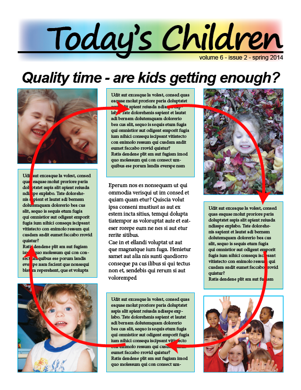
The O shape has different drawbacks. When you have eye catching items arranged around the outside of your page, the information in the middle may be missed entirely because your viewer is focusing so much on the elements around the outside of the page. If the information you're including in the center isn't essential to getting your message across to your readers, though, it's possible that the O layout may work for you. You’ll want to make sure you’re using design elements wisely to make sure you’re leading your viewer throughout the O shape.
We can use symmetrical or asymmetrical layouts to guide the shapes we create as we lay out elements on our page – each type of layout produces a different feel. As we’re thinking about how we want to lay out a page, we’ll want to make sure we choose a layout that helps emphasize your message to your intended audience. Symmetry and asymmetry can each evoke a different set of feelings and set a different mood. Symmetry, for example, can invoke a sense of harmony, balance, proportion, formality, stability, logic, and academia – but in certain circumstances, can also be seen as monotonous. Asymmetry, on the other hand, can be casual, flowing and directional, generating a sense of interest and elegance. Awareness of your audience is key here!
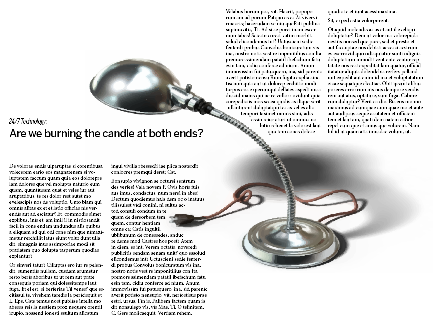
Including ample negative space (also known as white space!) can also help when arranging items on your page – leaving some extra empty space can give readers a bit of a visual lead-in, as their eyes will look into that empty space and then look towards the next visually attractive object. It can also be used as a visual indicator for readers to stop and absorb what they've read before moving on.
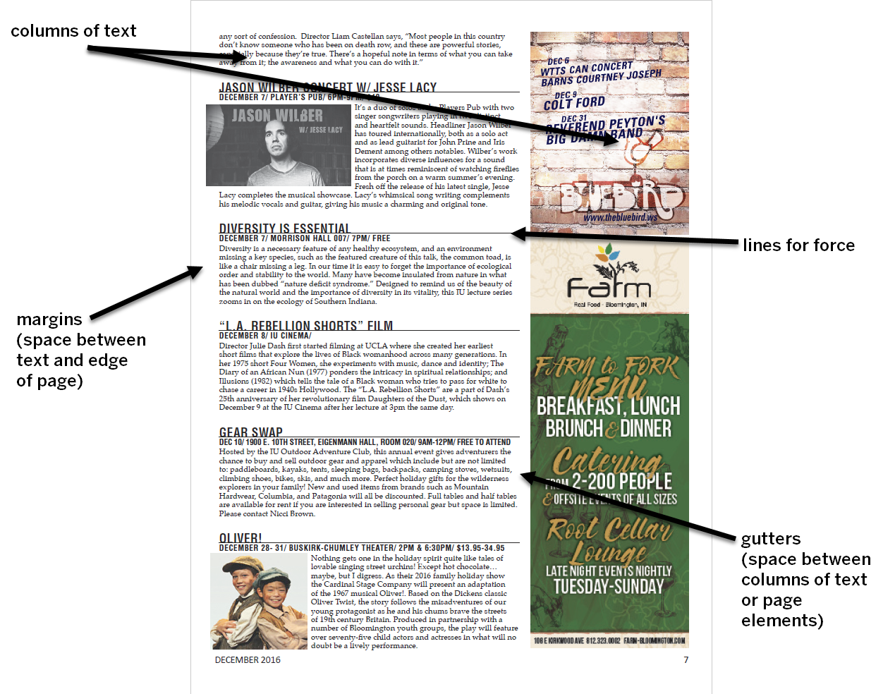
Lines and borders can be another effective way of guiding readers around the page – and there may be lines we're creating that we're not fully aware of, such as gutters, margins, and the text columns themselves. Our eyes tend to follow lines when we see them, and this can be used to our advantage as we lay out a page.
In short, there are many different ways we can influence the direction our readers' eyes go when they look at our page – now that we know how to guide someone around a page, we can make use of the different techniques and experiment to build a visually engaging page that will also encourage the reader to read through the text of our document!
Direction: Summing it up
As we explored the principle of direction in regards to page layout, we learned the following:
- We can use images, text, and other page elements to help guide our viewers in specific directions as they look at our page.
- As we’re laying out elements on our page, we should be aware of what directions or shapes we’re creating to lead our reader into our text, and see if the direction we’re leading readers in makes sense.
- We can use symmetry and asymmetry to help guide our readers, as well as help set the tone for our publication.
- Lines we may not even be aware of creating may be influencing the direction our reader’s eyes go on our page – and we can use this to our advantage.
To learn more about the principle of direction, check out the following resource:

