It's a good idea to gather resources you might need before starting the design process.
Allowing time to think about potential design elements is an important part of the creative process - and it's one of the first things you should do when approaching a design project. Just as a painter assembles their materials and a palette of colors prior to starting a painting, we as page designers should assemble our own "palette" of sample items that represent ideas about the publication, or act as inspiration for the design process.
Examples of items that might be used as resources include the following:
Text to be used in the publication
Whatever text that will be included - whether it's articles or a story or other information - can help guide the design process. Understanding the tone of the text included in the publication will help when it comes to crafting the layout and design.
Images that will be incorporated in the finished publication
Having the images you'll be using in the finished publication can also give you an idea of what the tone of the publication should be - plus, you can also use the images to draw inspiration for color schemes.
Color swatches
Color swatches can be useful for inspiration - choosing colors ahead of time can help you as you construct your layout. There are many places you can collect color swatches from, including Pantone color swatch books, websites that focus on building color schemes, and even paint swatches can help in the inspiration process.

Text, fonts, and colors are always good to have on hand before you jump into the design process.
Examples of different fonts
Collecting different fonts you might want to use can be helpful for the design process. This will help you narrow down your font choices ahead of time, and you can also experiment with different fonts and see which ones will look best for your publication ahead of time.
Related layouts to use for inspiration
Sometimes, you might see a layout for a publication that you like and want to try to emulate or build upon. Hang onto them - they can give you ideas as you work to lay out a publication.
A rough sketch of the publication you're working to design

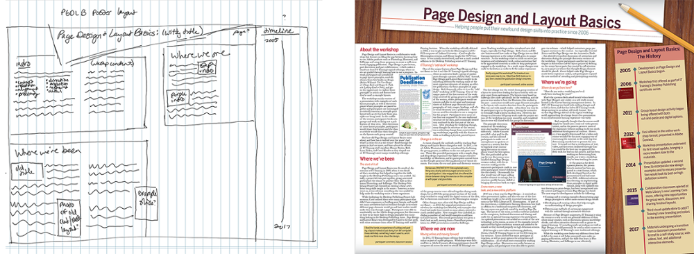
An example of a thumbnail sketch, and the completed poster based on the thumbnail sketch.
Sketching out what you'd like the publication to look like ahead of time can be an incredibly helpful resource as you work on assembling your layout. A sketch can help guide you as you lay out your document, and can give you a way to figure out how to organize your document before assembling it. This process is also known as thumbnailing. The preceding picture is a good example of a thumbnailed poster sketch, paired with the resulting poster created from that thumbnail sketch.
After we’ve collected resources to help us along in the design process, it’s a good idea to stop and think about the essential design principles that will help us put together an effective publication.

