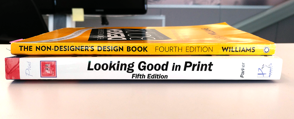
The essential design principles we'll be focusing on come from these books, written by Robin Williams and Roger C. Parker.
As we design our publication, we'll want to keep some basic design principles in mind as we assemble our layout in order to help us as we compose our page layout. These principles have been distilled from two books on layout and design, and are as follows:
From Robin Williams' The Non-Designer's Design Book:
- Contrast: Make sure elements stand out from each other in some way, shape, or form
- Repetition: Keep things consistent as you design by using the same fonts, colors, margins, etc. throughout the document
- Alignment: Make sure page elements are aligned with each other
- Proximity: Group related items together on the page
From Roger C. Parker's Looking Good in Print:
- Direction: Think about how the document will draw the eye around the page
- Proportion: Making use of size to help convey importance
- Restraint: Too many eye-catching items on a page may distract a reader from the message
- Detail: Pay attention to the little details of layout
While the four principles from The Non-Designer's Design Book have a rather unfortunate acronym, it can help you remember the principles. If you don't want your design to look like, well, you know - remember the principles of contrast, repetition, alignment, and proximity, as well as direction, proportion, restraint, and detail!
Let's start exploring these layout principles in more depth, starting with contrast.

