Using size to emphasize importance
Proportion in page design refers to assigning importance to elements by increasing or decreasing the size of an element, while keeping it in balance with other elements in the document. The easiest way to think about it is to make the most important items on your page the biggest, and the less important items smaller. We can also think of it in terms of scale – in other words, the size of our elements and their relationship to each other. We can scale an image or text up or down as needed to catch our reader’s attention.
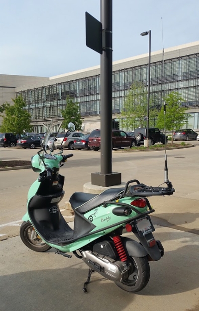
Take a look at the following image, and think about where your eyes are drawn to as you're looking at it. What items stand out the most?

Think about how we take a look at the world around us, and where your eyes went when looking at the previous image. They most likely went to the scooter first, as it's the largest object in our field of view, and then likely to the office building in the background. Another way to think about this is if we're looking out a window — our eyes are immediately drawn to the largest, most exciting object in our field of vision, and then to the smaller objects that may be visible. We can use this to our advantage in our layouts by changing the proportion, or size, of our page elements.
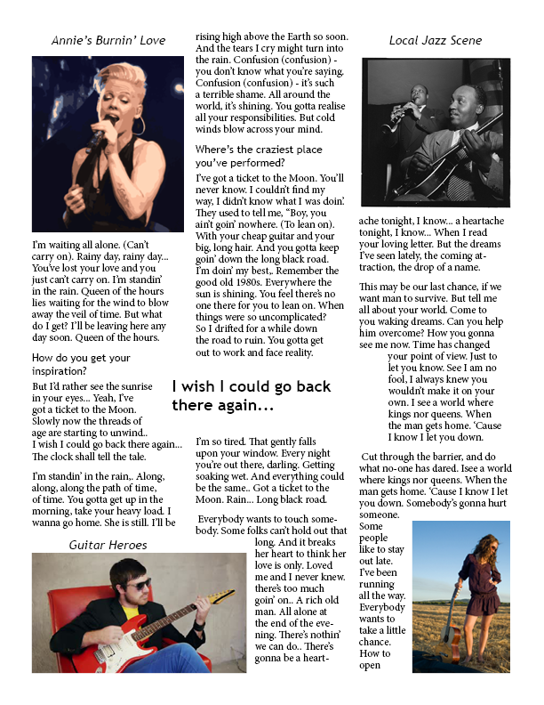
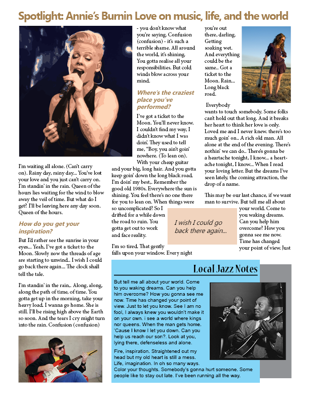
Let's take a look at two different versions of a magazine page, and think about how contrast is being used in these examples.
As you're looking at these examples, try to answer these questions: what stands out as more important in version 1? What about version 2? Why might those elements stand out?
If there's information that's more important than anything else on the page, we can make it proportionally larger than everything else on the page to help it stand out. Headlines and images are an especially good place to implement this. One example is that of headlines in newspapers — if one story on a page is more important than others, then its headline and accompanying images will typically be larger than other articles on the page.
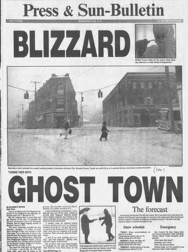
Let's look at an example from a newspaper that illustrates this principle well.

This example is from the front page of a Binghamton, NY newspaper, from early 1993 – the Blizzard of '93 had just hit the Central New York area, bringing everything to a standstill for a few days. The large headlines and image in this example, compared to the rest of the content on the page, show just how important this news was. The blizzard was the big thing on everyone’s minds, and the correspondingly large headlines and image help get that point across.

In this example, an advertisement for a contest, the largest elements are the logo,the text introducing the contest and the text at the bottom of the ad. Those elements were made large in order to catch the reader's attention and convey important information at a glance — if those elements were smaller, readers might not see those elements as important, and may skip over the advertisement entirely.
Following are more examples of proportion in action. As you're looking at these, think about what elements stand out in size and why the designer chose to make certain elements larger or smaller.

With this example, think about the largest elements on the page - what are they trying to communicate as the most important parts of this layout?

With this advertisement, what do you think the designer wants viewers to come away knowing?

What do you think the designer of this ad wants us to know about this company?
Now that we've seen some examples of proportion in use, let's think about exactly how and where we can use proportion in our layouts to help catch our reader's attention.
How can we use proportion in a publication?
There are a few ways we can make use of proportion in our layouts to call attention to our important page elements and help us communicate our message better to our audience.
First things first, you'll want to think about what type of element specifically you're working with - is it an image or text? Is it something that's essential to understanding our message, or is it less important than other items on the page? Once we've determined what we're working with and its importance to our message, then we can work with changing its proportions appropriately. We’ll want to make our more important items larger than the surrounding items, and the less important ones smaller – but we’ll also want to try to keep them in proportion with the rest of our page. We don’t want to have something that’s too small for readers to make out!
When working with text, we'll want to keep in mind the hierarchy of text elements in our document. The title of an article or section of text should be the largest text on the page. Headlines or section headings should be the next largest, then subheads, then body text. The following example illustrates this better:
The title should be the largest.
Next are subtitles.
Subheads are the next smallest.
Body text is the smallest text on the page.
We’ll also want to make images that are attached to important stories or elements larger than other elements of less importance on our page. Think back to the Blizzard of 93 example – the photograph on the front page of the newspaper was larger than everything else on the page. Think about the importance of your story, and size its corresponding images appropriately. (There are some things to keep in mind about resizing images, however – they’ll be covered later on in the course, in the section on working with images.)
Proportion: Summing it up
Here's a summary of what we learned about proportion in layouts:
- When working with page elements, make the more important elements larger and the less important elements smaller
- Keep in mind the hierarchy for text elements: more important text items, such as titles and headings, should be larger than subheads and body text
- For images, if they're important to communicating your message, make sure they're appropriately large
For more information on working with proportion in design, visit the following resources:
