Don't overwhelm your readers
Restraint can sometimes be the most difficult principle to work with. Exercising restraint in design – focusing on keeping things simple – is hard to do when you’ve got access to powerful page design software and infinite amounts of different elements we can incorporate into a page. However, it’s important to exercise restraint when we’re designing a publication – if we have too many eye-catching items on our page, our reader’s eye won’t know where to go first. Instead, our readers might be more focused on the different fonts we’re using, the images we’ve incorporated, and the colors we’ve used, and focus less on the message we’re trying to convey. The visual elements we choose should enrich and emphasize our message, not distract from it.
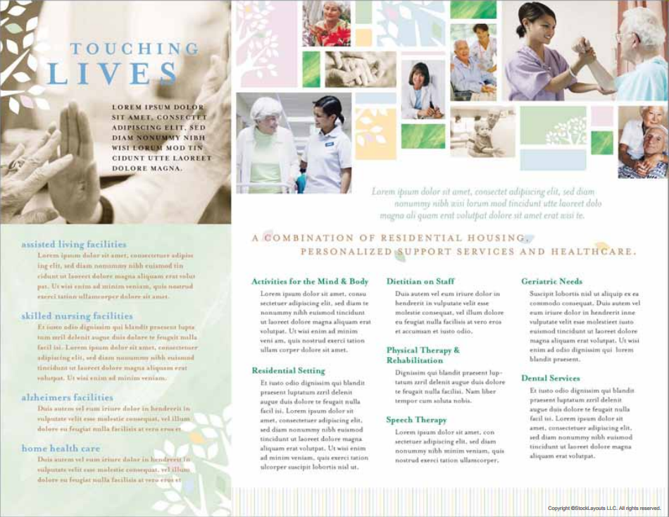
Following is an example of a publication that doesn’t have much restraint when it comes to design:

This layout, which is the inside of a trifold brochure, makes use of so many different page elements and ends up feeling a little cluttered and overwhelming. While they’ve worked to incorporate the tree motif throughout the design, it feels almost like there are leaves everywhere. Also, look at the colors of the text – there are five different colors in use here. It looks like they’ve tried to incorporate so many different things onto this page, and in the process they’ve ended up distracting their readers from the message they’re trying to get across.
So, how can we exercise restraint when putting together our layout? Let’s find out.
How can we use restraint in a publication?
Restraint ties into the principle of repetition in a layout – when building our layout, we want to be consistent with how we put together our page. There are many ways we can exercise restraint and be consistent with our layout:
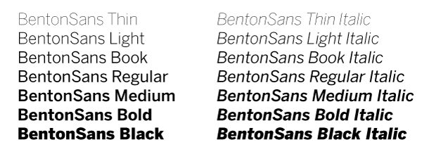
- Text: Limit font choices to two, maybe three fonts total – but that doesn't mean you can't use the many different font faces of each font, such as bold, italic, book, condensed, etc. For example, look at the many different faces of BentonSans:

There are fourteen different faces of the font BentonSans alone! This gives you a lot of variety and flexibility, even if you stick with just using the one font. - Colors: Make sure you choose a color palette ahead of time, and work with only the chosen colors from that palette.
- Images: Make sure images are relevant to the message you're trying to convey – try not to use stock images that are too generic. Also, make sure your images are relevant to your audience as well as your message –for example, cartoon-like illustrations wouldn’t fit well into a report about a technology firm’s recent earnings.
Restraint: Summing it up
Here’s what we’ve learned about restraint:
- It’s important to exercise restraint when building a layout – otherwise, we may end up distracting our audience from the message we’re trying to communicate
- Putting together a limited collection of colors and fonts ahead of time can help us exercise restraint when designing
- Choosing images that directly relate to our message will also help when exercising restraint in layout design
For more information on restraint in design, check out the following resources:

