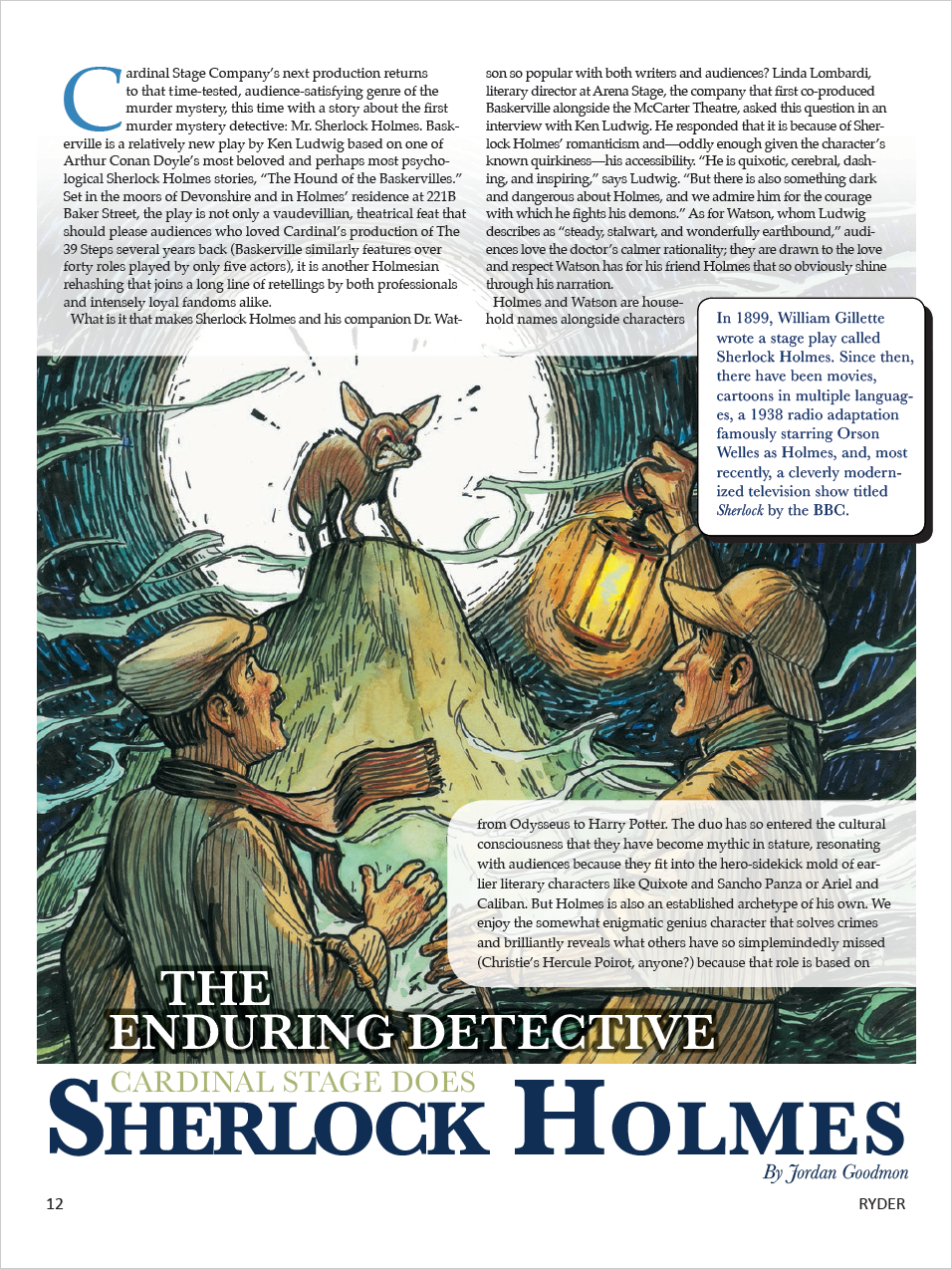
We’ve mentioned working with color a number of times throughout the course already, and we’re now going to explore working with color in more depth.
Color is important to consider when assembling your layout. Picking the appropriate color scheme for your layout is essential when attempting to communicate your message to your audience - you want to make sure that the colors chosen help emphasize your message, as opposed to distracting from it. The colors you choose will help set the tone for your design - and while choosing colors can be an intimidating task, there are some things that will help you in the process of choosing colors for your layout.
Color models
As mentioned previously, there are a number of different color models to work with. Typically, when designing a layout, you'll be working with either the RGB color model, the CMYK color model, or Pantone colors. Working with the RGB and CMYK color models is a little different than working with Pantone colors - let's focus on RGB and CMYK color first.
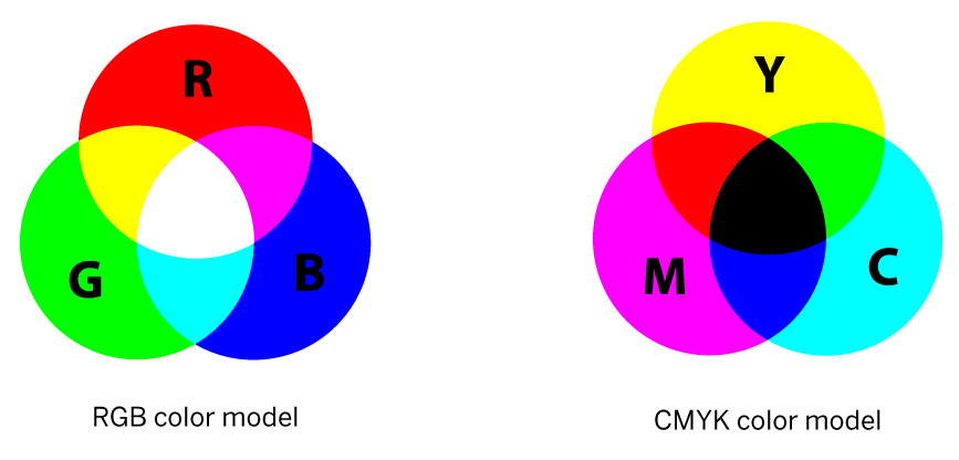
RGB is the color model primarily intended for displaying color on screens. Colors in the RGB color model are created by combining different amounts of red, green, and blue light to display images on a screen. The RGB color model is also referred to as an additive color model, as colored lights are added together to create specific colors. When red, green, and blue light are added together, we end up with white. CMYK, on the other hand, is a subtractive color model – this refers to how certain wavelengths of light are absorbed, or subtracted, in the process of creating a color. The CMYK color model is typically used for print, and colors in the CMYK color model are created by combining different amounts of cyan, magenta, yellow, and black ink. When creating your document, you want to be aware of the intended output – print or screen – and choose the appropriate color model for your intended output. If you’re working with the wrong color model, such as RGB for a printed document, the colors that appear in the final product might not look quite as you intended.
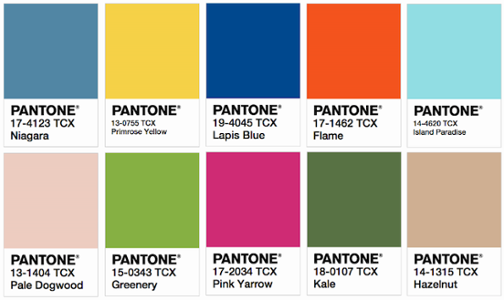
Pantone colors are a little different. Each color in the Pantone spectrum has a special code, and that code refers to a specific color of ink. Pantone inks are typically used for spot color printing - spot color means that you’re only printing with a specific colored ink of your choice, as well as black ink, and using those two colors to create a number of different value variations. Printing in spot color can be more economical than printing in full color, as you’re only working with the one color (or possibly two colors) in addition to black. Pantone colors can also reflect branding. Keep in mind that you can look up RGB and CMYK equivalents to match, as best as possible, any Pantone color.
The following layout is one example of printing in spot color:

This example, which is the cover of a training catalog, had a large print run due to being distributed all across a college campus. As such, in order to keep costs low for printing such a high volume of documents, the designer chose to work with a purple spot color for this layout, purple being the main branding color for the department. Even with just the one spot color, the design still helps communicate the intended message, which focuses on training opportunities.
Choosing colors
It’s been mentioned previously, especially in the repetition and restraint sections, but you’ll want to determine the colors for your publication ahead of time, before you start your design. Sometimes you might be limited to a specific color palette determined by your company, but if not, you'll need to create your own color palette for your layout. Building a color palette can take time – and can also be an intimidating task. However, sites like Adobe Color, Paletton, and Colour Lovers can assist in the process of choosing colors and creating palettes.
As you’re choosing your colors, think about your audience and message, and the moods you want to evoke in your publication – colors can help establish a specific mood. (However, color and mood associations are culturally dependent, so you’ll want to keep that in mind as you design.) This exhaustive list of colors and their associated moods, both good and bad, can help you in the color decision process.
Following are example layouts with a variety of colors being used to evoke a specific mood. When you look at these layouts, think about the types of feelings they evoke in you.


