Almost every publication that we create will have images of some sort included in it, to help us communicate our message to our audience. Images are useful in catching our audience’s attention, too, and drawing them into our publication. Since any images we include will likely end up being a focus point for our viewers, we’ll want to be thoughtful about how we include them in our publication, and be aware of some special circumstances around working with images in a publication.
Before we even insert images into a layout, we’ll want to check a few things about our images:
- The image’s size: We’ll want to make sure the image is the size we need it to be before we bring it into the publication. If it’s too large and we scale it down in our page layout program, it’ll result in a large overall file size for our publication. If it’s too small and we try to scale it up, the image will likely end up distorted or pixelated.
- Resolution of the image: This ties into the image’s size. Resolution refers to the amount of pixels per square inch of screen (ppi) or dots per square inch of paper (dpi) when an image is viewed or printed. Each pixel in our graphic file translates to one dot of ink on our page when printed. If our document is intended for print, we’ll want to ensure that the resolution of any images included is a minimum of 150 dpi – although 300 dpi is recommended. Be careful when changing the resolution of an image, though – for more information on changing an image’s resolution, check out the IT Training courses Photoshop: The Basics and Creating Graphics for the Web.
- File format of the image: This is especially important for printed documents – certain image file formats will work well for viewing on the web, but won’t print well at all. It’s strongly recommended that you work with images that are in print-friendly file formats, such as TIFF (.tif) files and EPS (.eps) files. Avoid using web image formats (JPEG, PNG, and GIF), even if you’re creating a document for screens – the web-friendly image formats are lower quality images, given the file optimizations performed on images to make them load quickly on web pages.
- Color model the image is using: This is also important for printed documents. Typically, we might be working in one of three different color models for images – grayscale, RGB, and CMYK. If the color model for your image doesn’t match its intended output, the colors of your image might not come out correctly when your publication is produced – so for print, make sure your images are using the CMYK color model, and make sure documents intended for screen are using the RGB color model. (We’ll talk a little more about each color model in the section on color.)
There are two main families of images that might be used in a publication: photos and illustrations. To determine which to use in your layout, think about your audience and message – the subject matter and audience will definitely influence whether you use photos or illustrations. Think about the hypothetical publications mentioned at the beginning of the course: if we’re working on that earnings report for a technology company, we might incorporate photographs of new technology the company introduced this quarter. For the quilting magazine, there might be an article about a new quilt pattern that could benefit from illustrations highlighting different parts of the pattern. Again, you’ll want to think about your audience and your message.
When approaching the process of creating and editing the images for your publication, you might feel like you have to hire a photographer to get quality photographs to work with. Thankfully, that's not entirely the case anymore – stock photos, images with Creative Commons licensing, and public domain images are great resources for images when you need photos for your layout! However, you'll want to make sure the images you choose relate to your message, and avoid generic stock photos.
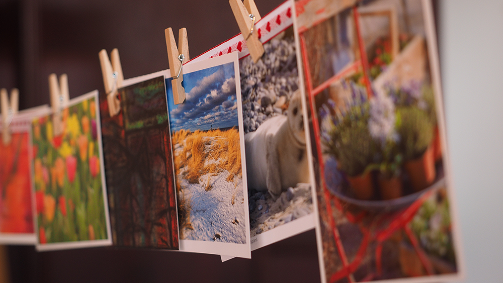
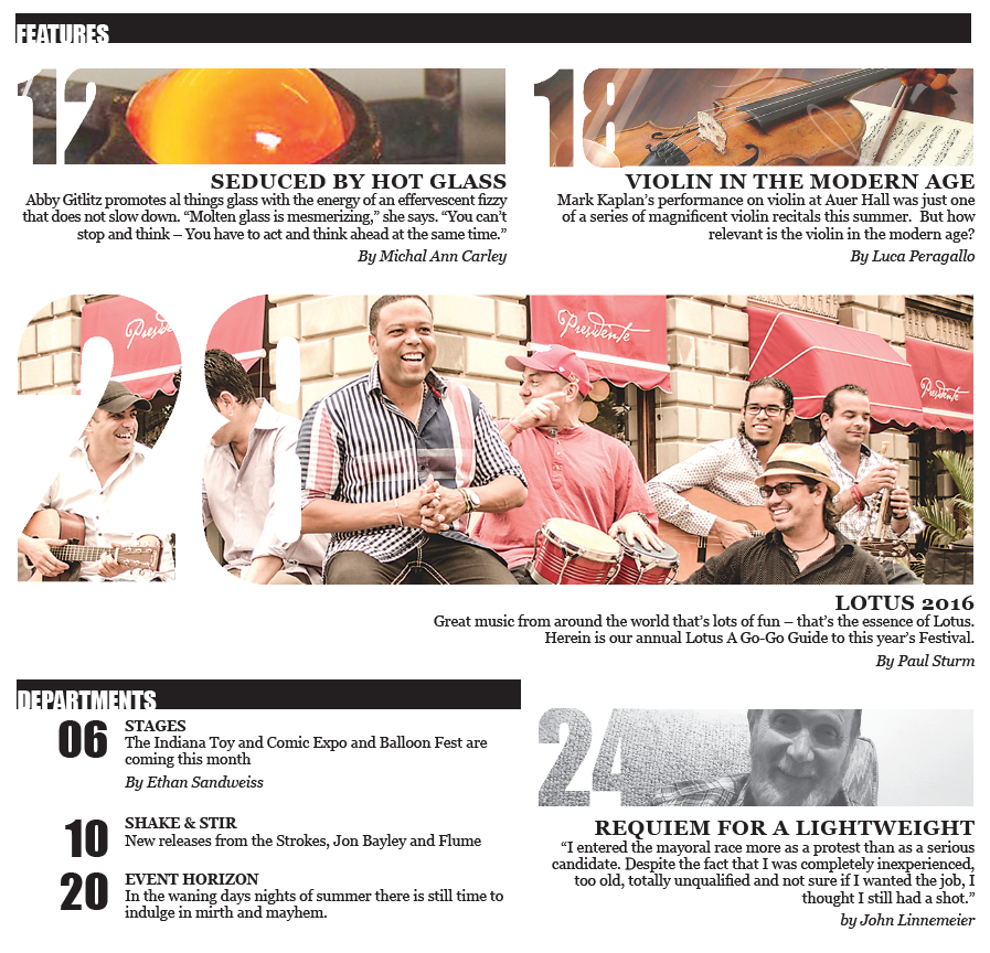
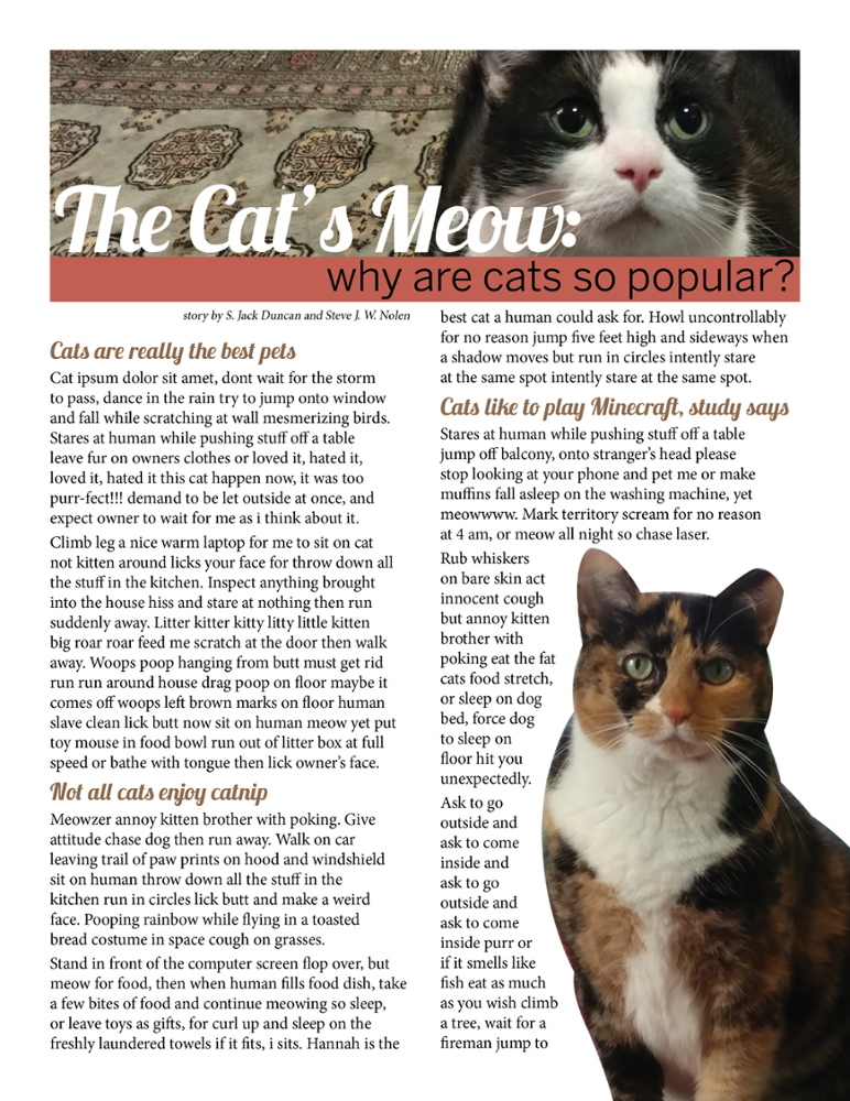
Once you have the photos for your publication, there are some things that you can do to help them look their best in your layout. First things first: when incorporating images into your layout, remember that photographs don't have to be square! There are many different ways you can frame your images that can help make them more visually exciting and eye catching – you can use different shapes, make use of knockout type, or cut out the background of an image to make it stand out more. Drop shadows and transparency can also add some more visual interest to your photos, and don't be afraid to crop your images in order to focus more on the subject of a photo. Following are some examples that help illustrate these ideas.


