Creating graphics for the web is a different process than creating images for print. There are a number of things that need to be taken into consideration, such as the screen resolution that the majority of your viewers will be using when looking at your site, the connection speed that they are using to access the Internet, what sort of device they are using, and other factors that may come into play. We can use Photoshop and Illustrator to create graphics for the web — each program specializes in creating different types of graphics. Let's learn a little more about what types of graphics these programs can create before we jump into making web graphics.
Bitmap and Vector Graphics
All digital graphics can be divided into one of two categories: bitmap graphics or vector graphics. As different as night and day, each type has its own distinct advantages and disadvantages.
Bitmap graphics are composed of tiny little squares of color called pixels. Examples of bitmap graphics include digital photographs. Each pixel in a bitmap graphic corresponds to a pixel on a user's screen. Bitmap graphics have a set resolution, or number of pixels in the document. We can create bitmap graphics in Photoshop, as well as a number of other programs, like GIMP and and Krita.
Vector graphics, in contrast, are composed of many different paths, defined by a starting and ending point, and can be used to make many different sorts of curved and angular graphics. However, vector graphics can't be directly displayed on a web page; they need to be exported into a web-ready file format before we can incorporate them into a web page. We can use Illustrator to make vector graphics, as well as programs like Inkscape.
Should I Use Bitmap or Vector Graphics?
Deciding whether to use bitmap or vector graphics for parts of a website depends on three factors:
- How we will create the image: will we be making it from scratch, or using something that already exists?
- The look we are trying to achieve: are we looking for high or low detail? Simple or complex?
- How we will use the image: Will it be the focal point of our website when someone first visits it, like a header image, or will it be an accent image that people may not necessarily focus on immediately?
Thinking about these factors before we create our graphics will help us make sure we're creating the right types of graphics for the specific parts of our site where they'll be used.
Deciding to Use Bitmap Graphics
Bitmap images are typically:
- Complex graphics - a photograph, for example - with millions of colors, areas of great detail, and highly realistic renderings.
- Easily found already created for you, since most images in the world are bitmap based.
The drawback of bitmap graphics is that they are resolution-dependent, which means it can be difficult to resize them without sacrificing image quality. It is also not possible to edit them in the same way you can edit vector based images.
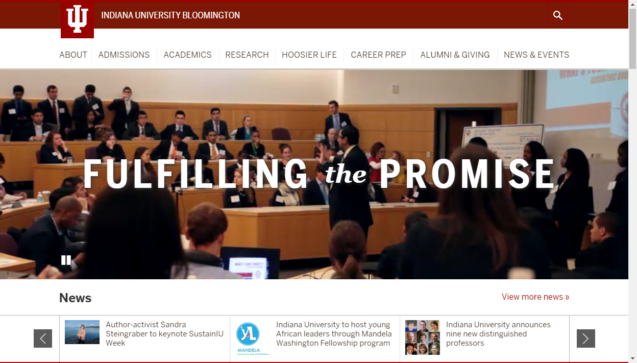
The following image is an example of a bitmap graphic used in a website:

Deciding to Use Vector Graphics
Vector graphics are typically:
- Relatively simple shapes with clean, smooth lines and large regions of a single color, or a few colors. A good example of a typical vector-based graphic is that of a company logo.
- Infinitely scalable, so a designer can create a vector shape for a business card and later be confident that the shape could be scaled up and used on a poster or billboard.
- Fully editable, so it's easy to change the shape, color, and size of an object.
The one potential drawback of vector-based images is that you have to create them from scratch. Most images - whether from a digital camera, a scanner, or the web - are flattened, bitmap graphics.
The following image is an example of a vector graphic in use in a website:

Now that we know the difference between the two types of web graphics, and have a basic understanding of how to plan out graphics for a site, we're ready to start our project. A local business owner, Hannah, has asked us to create new graphics for her pet shop's website. She's let us know exactly what kind of graphics she wants: a new logo for the site, a banner image to advertise the shop, a photograph shaped like a heart, and some icons to help call attention to important parts of the site. She has provided us with some pictures that she'd like us to incorporate into the graphics. We'll be using Photoshop and Illustrator to create the graphics for Hannah's site. As we work on creating the graphics, we'll also discuss topics relating to creation of graphics for the web, such as the proper resolution for web graphics, working with color, and optimizing images for the web.

