Dreamweaver makes the creation and application of CSS rules fairly easy. By working with CSS in Dreamweaver, we can set a whole range of properties to control the appearance of elements on our page.
Setting up the Interface to Work with CSS
When creating CSS, we want to work in Live view. Live view provides a more realistic render of what a page will look like in a browser than Design view.
Step1. Open structure.html, if necessary.
Step2. To switch to Live view,
Click![]() , Click Live
, Click Live
Step3. To view the CSS Designer panel,
Click![]()
Creating a New Style Sheet
We need a place to store our styles for our site. As mentioned in HTML5 & CSS: The Basics, there are several places styles can be placed. One place we can store our styles is in an external style sheet. When using an external style sheet, there is a reference in the head element of the HTML document to a separate file that contains the CSS rules. This allows us to use the same styles in multiple HTML documents. For more information about external style sheets, consider taking the workshop HTML5 & CSS: Structuring Pages.
Step1. To start to create a style sheet,
Click , Click Create A New CSS File
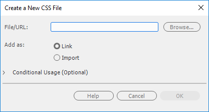
Step2. In the File/URL field, type:
bigfive Enter
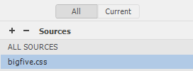
Step3. To collapse the Sources section, in the CSS Designer,
Click Sources
Step4. To collapse the @Media section, if necessary,
Click @Media
Selecting Items
When we are creating styles in Dreamweaver, selecting the appropriate element will make defining selectors easier. There are multiple ways to select an element inside of Dreamweaver. Let's try some of these methods.
The most straightforward is to click on or inside an element.
Step1. To select the h1 element,
Click in the text "Africa's Big Five"

Step2. To try to select the header element,
Click near the top left corner of the page
Step3. To select the header in the DOM panel,
Click![]()

Step4. To select the div, in the tag selector,
Click![]()
Step5. To reselect the header, which is a child of the div, press:
Control key+]
Step6. To reselect the div parent element of the header,
Control key+[
Adding Styles to the Nav Element
First we will style the nav element that contains the navigational links for our website.
Step1. To select the nav element in the DOM panel,
Click![]()
Step2. To start to add a selector, in the CSS Designer,
Click![]()
Step3. To make the selector less specific, press:
Up Arrow key twice
Step4. To accept the selector, press:
Enter
NOTE: If we accidentally create the wrong selector, we can either double click the selector and type the correct selector, or click on the selector and hit the delete key to remove it.
Step5. To deselect the Show Set checkbox, in the Properties section of the CSS Designer panel, if necessary,
Click![]()

Step6. To view the Background properties,
Click
Step7. To open the background color options, next to background-color,
Click
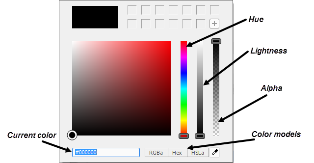
Step8. To use the RGBa colors, if necessary,
Click![]()
Step9. To change the opacity,
Press & Drag the Alpha slider to 0.50, press: Enter

Assigning a Custom Keyboard Shortcut
The fact that the Save All command doesn't have a shortcut is something we can fix. In most Adobe programs we can change the default shortcuts and create shortcuts.
We will assign a shortcut to the Save All command.
Step1. To view the keyboard shortcuts, on the menu bar,
Click Edit, Click Keyboard Shortcuts...
NOTE for MacOS Users: To view the keyboard shortcuts, on the menu bar, Click Dreamweaver CC, Click Keyboard Shortcuts...
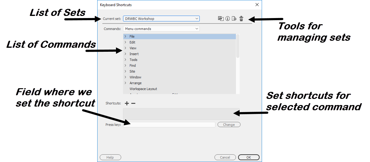
Step2. To start to duplicate the shortcuts, in the upper-right corner of the dialog box,
Click![]()
Step3. To name the duplicate set, type:
DRWBC workshop Enter
Step4. To select the Save All command, in the commands section,
Click![]() in front of File, Click Save All
in front of File, Click Save All
Step5. To position the cursor,
Click in the Press key field
Step6. To enter the shortcut in the field, press:
Control key+Shift key+Alt key+s
Step7. To create the shortcut,
Click![]()

Step8. To close the Keyboard Shortcuts dialog box,
Click![]()
Step9. To save all open files,
Control key+Shift key+Alt key+s
Changing Properties for Unordered List
We want our navigation to be horizontal rather than vertical. To change this, we will use CSS to make the unordered list act like a table element, and the list items to act like cells in the table.
Step1. To expand the nav element in the DOM panel, if necessary
Click![]()
Step2. To select the unordered list, in the DOM panel,
Click![]()
Step3. To start to add a selector, in the CSS Designer panel,
Click![]() next to Selectors
next to Selectors
Step4. To make the selector less specific, press:
Up Arrow key
Step5. To accept the selector, press:
Enter
Step6. To view the Layout properties, if necessary,
Click
Step7. To change the way that the ul is displayed, next to display,
Click![]() , Click table
, Click table
Step8. To save all open files,
Control key+Shift key+Alt key+s
Changing Properties for List Items
Now we need to make the list items act like cells of the table. We are going to make sure our selector only applies this style to the list items of an unordered list that are nested inside a nav element.
Let's make some more room for the CSS Designer and the properties area.
Step1. To collapse the DOM panel,
Double-Click![]()
Step2. To position the cursor,
Point above Properties until the double arrow icon appears

Step3. To expand the Properties area,
Press & Drag upwards
Step4. To select one of the links, in the Document window,
Click Elephant
Step5. To select the parent list item of the link, in the tag selector,
Click![]()

Step6. To add a property,
Click![]() next to Selectors, press: Enter
next to Selectors, press: Enter
Step7. To view the Layout properties, if necessary,
Click
Step8. To change the display property for the list items,
Click![]() , Click table-cell
, Click table-cell
Step9. To add a width,
Click![]() , Click px, type: 129, press: Enter
, Click px, type: 129, press: Enter
Step10. To change the padding properties,
Click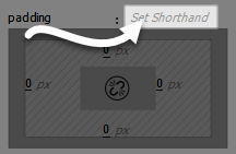 , type: 10px 15px, press: Enter
Step11. To save all open files, press:
Control key+Shift key+Alt key+s
Adding Link Properties
The default blue color of the links does not have enough contrast between the background color we previously set, nor would the blue color fit into our final design. We also don't want to have the links in the nav element to be underlined, since we are planning to make these links look more like buttons.
Step1. To select an anchor element in the nav element, if necessary,
Click on the text "Elephant"
Step2. To add a new selector,
Click![]() next to Selectors
next to Selectors
Step3. To make the selector more specific, press:
Down Arrow key, Enter
Step4. To view Text properties,
Click
Step5. To view the color properties, under Text,
Click![]()
Step6. To change the type of color to hex,
Click![]()
Step7. To change the color to white,
Press & Drag the middle slider to the top
Step8. To accept these changes, press:
Enter
Step9. To remove the underline, next to the text-decoration property,
Click
Step10. To save all open files, press:
Control key+Shift key+Alt key+s
Adding Styles for the Body Element
There is a bug in Dreamweaver CC 2021 where sometimes positioning the cursor in the Design or Live view and then adding a selector doesn't generate the expected selector. The bug happens with the body element, once there is a paragraph element anywhere in the code.
Instead of the expected selector, Dreamweaver provides the selector of body p, which is fine if we want to style the paragraphs that are nested inside the body element. However, we want to style the body element itself. We will edit the provided selector to get around this bug.
Step1. To select the body, in the tag selector,
Click![]()
Step2. To add the body selector to the CSS document,
Click![]() next to Selectors
next to Selectors
Step3. To remove the extra space and the p,
Click after the p, press: Backspace twice
Step4. To accept the change, press:
Enter twice
Setting Background Properties
First we are going to add a background color and image to the body element.
Step1. To change the Background properties,
Click
Step2. To set the background color:
Click , type: #737169 Enter
Step3. To start setting the background image, next to the url field,
Click![]()
Step4. To select the appropriate file,
Double-Click bg_tile.gif
Setting Font Properties
We will adjust the color and fonts used in our page. Remember, elements that are descendants of the body will inherit font properties from the body, so by setting the fonts for the body, we are also styling the font for the rest of the content.
Step1. To start to add Text properties,
Click
Step2. To begin setting the font color, under Text,
Click![]()
Step3. To change the color to white,
Press & Drag the middle slider to the top
Step4. To accept the changes, press:
Enter
Step5. To start to set the font,
Click![]()
Step6. To select the font list,
Click![]()
Step7. To save all open files, press:
Control key+Shift key+Alt key+s
Using a Snippet to Add CSS
We want to center our page in the browser. This is a common task and there is a snippet that can help us achieve this look.
This particular snippet needs to be added to the CSS code for the page. Notice that below the tab for structure.html we see options for Source Code and bigfive.css. These options let us choose if we are seeing the current document or a document referenced by the current document. The only other document our current HTML file references is bigfive.css.
Step1. To view the CSS code,
Click![]()
Step2. To switch to the Snippets panel, from the Menu bar,
Click Window, Click Snippets
Step3. To expand the CSS_Snippets folder,
Click![]() in front of the CSS_Snippets folder
in front of the CSS_Snippets folder
Step4. To position the cursor, if necessary,
Click below the existing code
Step5. To add the snippet,
Double-Click![]()
Step6. To collapse the Snippets panel,
Double-Click![]()
Step7. To show the HTML code,
Click![]()
Step8. To switch to Live view,
Click
Applying an ID to an Element
Step1. To position the cursor,
Click inside the text "Africa's Big Five"
Step2. To select the div, in the tag selector,
Click
Step3. To add the container id, on the Properties panel Div ID drop-down,
Click , Click container
Step4. To edit the #container selector, in the Selectors section of CSS Designer,
Click #container
Step5. To see the Layout properties, if necessary,
Click
Step6. To change the width,
Click 800px, type: 1024, press: Enter
Step7. To save all the files, press,
Control key+Shift key+Alt key+s
Controlling Order of Styles
As mentioned in HTML5 & CSS: The Basics, the order of styles can make a difference in how they are applied. When we create styles in Dreamweaver, they are added below the active selector in the CSS Designer. The current order for our rules is due to this behavior. The exception to this is the #container rule, which is at the bottom because we put the snippet of code below the other styles we had created using the CSS Designer. The order of the style rules in the code is also the order in the CSS Designer.
If we aren't paying attention to which selector is currently selected in the CSS Designer when creating new selectors, we may get our styles in a different order than we are expecting. Dreamweaver makes it very easy to rearrange the order of the styles.
In our case, we really would like both the body and #container rules to be above the rules for the nav.
Step1. To move the body rule, in the CSS Designer,
Press & Drag body selector above nav selector
Step2. To move the #container rule,
Press & Drag #container selector above nav selector
Adding Styles to Header
We now will concentrate on making the header more attractive. We will add a background image, round the lower corners of the header, and adjust the appearance of the h1 inside of the header.
Step1. To position the cursor,
Click in the text "Africa's Big Five"
Step2. To select the header, in the tag selector,
Click
Step3. To start to add a selector for the header element,
Click![]() next to Selectors
next to Selectors
Step4. To make the selector less specific, press:
Up Arrow key
Step5. To accept the selector, press:
Enter
Adding Background Properties
We want the header to have an image as a background to make it more attractive.
Step1. To change the Background properties,
Click
Step2. To start setting the background image, next to the url field,
Click![]()
Step3. To select the appropriate file,
Double-Click africa_banner.jpg
Adding Layout Properties
The height of an element is determined by its content. Background images are not content. Most of the time we let the content determine the height of elements, but there are times when content does not establish an appropriate height for an element. Since we want to see the entire image, we'll set a height for the header element.
Step1. To start to add Layout properties,
Click
Step2. To set the height of the header element,
Click the empty space to the right of the height field, Click px, type: 461, press: Enter
Adding Border Properties
We want our header to have rounded corners on lower-left and lower-right sides of the element. The properties we need to set to adjust the radius of the corners appear in the border properties in Dreamweaver.
Step1. To start to add border properties,
Click

Step2. To set the border-bottom-left-radius,
Click the current value, type: 40 Enter
Step3. To set the border-bottom-right-radius,
Click the current value, type: 40 Enter
Step4. To save all the files, press,
Control key+Shift key+Alt key+s
Styling the Heading Element
The heading for our page is getting lost in the image. We want to make it stand out on the page.
Step1. To select the h1,
Click in the text "Africa's Big Five"
Step2. To create a new selector,
Click![]() next to Selectors
next to Selectors
Step3. To make selector less specific, press:
Up Arrow key, Enter
Step4. To view Text properties,
Click
Step5. To change the font color, under Text:
Click![]() , type: #dbcb5b, press: Enter
, type: #dbcb5b, press: Enter
Step6. To change the font size,
Click the empty space to the right of the font-size field, Click %, type: 300, press: Enter
Step7. To change the line-height,
Click the empty space to the right of the line-height field, Click %, type: 90, press: Enter
Step8. To center the heading, next to text-align,
Click![]()
Step9. To save all the files, press,
Control key+Shift key+Alt key+s
Styling Hover, Active, and Focus Pseudo-class Selectors
We styled the links earlier by changing the color of the font, but we would like to make it more obvious that the links are clickable. We will style the links so that if we hover over them with the mouse or use the keyboard to activate them, they have a different style.
Links have special properties we can access using a type of selector called a pseudo-class. These classes are called "pseudo" because they affect a particular state of an element. For example, in HTML, hyperlinks have several states:
| Pseudo-class | Appears When |
|---|---|
| a:link | the link is viewed without having been visited |
| a:visited | the link is visited by the web browser |
| a:hover | the mouse pointer is directly over the clickable area of the hyperlink |
| a:active | the mouse clicks the hyperlink |
| a:focus | the keyboard focus is on the hyperlink |
Pseudo-classes allow us to define specific styles for these five different states of hyperlinks.
NOTE: When defining style for all of these pseudo-classes, they must be defined within the stylesheet in the order listed above.
We will need to use pseudo-class selectors to create our rule. For more information about pseudo-class selectors, consider taking the workshop HTML5 & CSS: Structuring Pages.
Overriding a Dreamweaver Provided Selector
As we saw earlier, there are times when selecting an element will not get us a selector applicable to the elements we want. Dreamweaver will always guess what selector is needed, but we can override the selector given to us by typing the desired selector.
We need a selector that will apply to the anchors in the nav element when they are being hovered over, are active, or have focus.
Step1. To position the new rule, in the CSS Designer,
Click nav ul li a
Step2. To add a new selector,
Click![]() next to Selectors
next to Selectors
Step3. To create the selector, type:
nav a:hover, nav a:active, nav a:focus Enter
Step4. To accept the selector, press:
Enter
Step5. To see type properties, if necessary,
Click
Step6. To change the color of the font, under Text,
Click![]() , type: #dbcb5b, press: Enter
, type: #dbcb5b, press: Enter
Step7. To save all the files, press:
Control key+Shift key+Alt key+s
Step8. To view the page in a web browser, press:
F12 key
NOTE for MacOS Users: To preview the page, press Option+FN key+F12 key.
Step9. Close the browser and return to Dreamweaver.
Styling Section
We want to style the section and the aside elements so they become columns below the heading. We also want to style both elements with a transparent color in the background similar to the style of the nav element.
Step1. To position the cursor,
Click in the lorem ipsum placeholder content
Step2. To select the section, in the tag selector;
Click
Step3. To add a new selector,
Click![]() next to Selectors
next to Selectors
Step4. To make the selector less specific, press:
Up Arrow key, Enter
Setting Properties for Section
Now that we have our selector, let's set the properties for the section.
Step1. To view Background properties,
Click
Step2. To start to set background-color,
Click
Step3. To change to RGBa color,
Click![]()
Step4. To set alpha,
Press & Drag Alpha slider to 0.50, press: Enter
Step5. To view Layout properties,
Click
Step6. To set the width of the section,
Click the empty space to the right of the width field, Click px, type: 631, press: Enter
Step7. To set the padding,
Click![]() , type: 10px, press: Enter
, type: 10px, press: Enter
Step8. If necessary, to view the float property,
scroll downward in the properties
Step9. To set float to left, next to the float property,
Click![]()

Step10. To save all the files, press:
Control key+Shift key+Alt key+s
Working with Classes
Before we move away from the section, we would like to style the image so that it is floated with the text wrapping around the image on the left.
Now, we could do this by creating a style that applies to images that are nested in the section element. However, there are two things we want to consider. First, we might not want all images in the section to float to the right. Second, there might be other items we would like to float to the right. A class that we can apply to any element is a solution to this issue.
Step1. To start to create a new selector,
Click![]() next to Selectors
next to Selectors
Step2. To change the selector, type:
.floatright Enter
Step3. To access the Layout properties, if necessary,
Click
Step4. If necessary to view the float property,
scroll downward in the properties
Step5. To set the float property,
Click![]()
Step6. To select the image,
Click the Image Placeholder
Step7. To apply the class, in the Class drop-down of the Properties panel,
Click![]() , Click floatright
, Click floatright
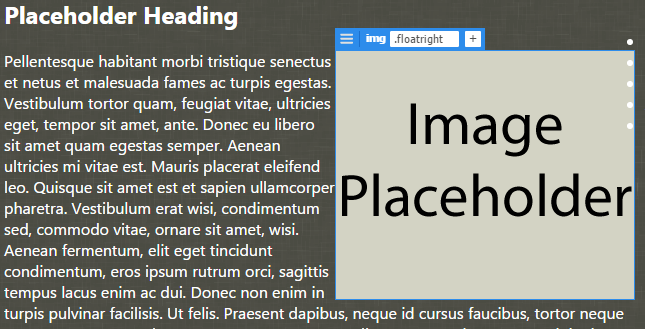
Step8. To save all the files, press,
Control key+Shift key+Alt key+s
Styling the Image
The text in the section is really too close to the edges of the image. This makes the text harder to read. Let's add some padding around the placeholder image.
Step1. To select the image, if necessary,
Click the Image Placeholder
Step2. To start to create a new selector,
Click![]() next to Selectors
next to Selectors
Step3. To enter the selector name, type:
section img Enter
Step4. To accept the selector, press:
Enter
Step5. To access the Layout properties, if necessary,
Click
Step6. To add padding on all sides,
Click![]() , type: 10px, press: Enter
, type: 10px, press: Enter
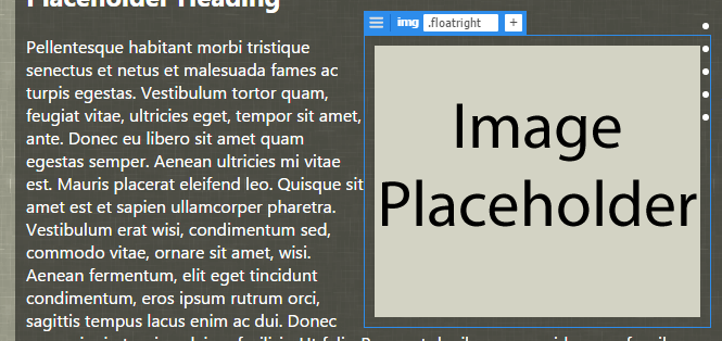
Step7. To save all the files, press,
Control key+Shift key+Alt key+s
Styling the Aside
We are going to turn the aside into a second column. First, we need to create the selector for the aside element.
Step1. To position the cursor,
Click in the text "Top 5 African Destinations"
NOTE: It may appear the h2 in the section is selected. Block level elements extend all the way across their parent elements until a specific width is set. In this case, the parent element of the h3 is the aside.
Step2. To select the aside, in the tag selector:
Click
Step3. To add a new selector.
Click![]() next to Selectors
next to Selectors
Step4. To make the selector less specific, press,
Up Arrow key, Enter
Copying Styles From Selectors
Since the aside will have many of the same properties as the section, we will copy the properties from the section rule and paste those properties into the aside rule.
Step1. To copy the styles from the section rule, in the CSS Designer,
Right-Click section, Click Copy All Styles
Step2. To paste the styles into the aside rule,
Right-Click aside, Click Paste Styles

Step3. To view Layout properties, if necessary,
Click
Step4. To adjust the width,
Click 631, type: 337, press: Enter
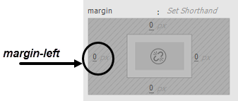
Step5. To add a margin to the left side,
Click the current value, type: 10, press: Enter
Step6. To save all the files, press,
Control key+Shift key+Alt key+s

Adding Styles to Footer
We are going to change the footer's properties so it can extend across the entire page, rather than being below the aside in the second column. We will do this using the clear property. Normally, content that appears on the page after a floated element will flow around it. The clear property pushes content below any floated elements.
Let's tell our footer to not allow floated items on either side, which will essentially push the footer to the bottom of our page.
Step1. To position the cursor, in the footer,
Click the text "IT Training"
Step2. To be sure the footer is selected, in the tag selector,
Click
Step3. To add a new selector,
Click![]() next to Selectors
next to Selectors
Step4. To make the selector less specific, press:
Up Arrow key, Enter
Step5. To view Layout properties, if necessary,
Click
Step6. Scroll down to see the clear property, if necessary.
Step7. To clear the floats, next to the clear property,
Click
Step8. To add padding to the footer, in the padding properties,
Click![]() , type: 10px 0, press: Enter
, type: 10px 0, press: Enter
Step9. To view the Text properties,
Click
Step10. To center footer,
Click![]()
Adding a Margin to the Header
The last thing we'd like to do is add a bit of space between the header and the section and aside. We could add a margin value to the top of both the section and aside, but it would be more efficient to add a margin to the bottom of the header.
Step1. In the Selector section of the CSS Designer,
Click the header rule
Step2. To view the Layout properties,
Click
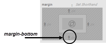
Step3. To set margin-bottom,
Click the current value, type: 10, press: Enter
Step4. To save any changes in the structure.html and bigfive.css files,
Control key+Shift key+Alt key+s
Step5. To view the page in a browser, press,
F12 key
NOTE for MacOS Users: To preview the page, press Option+FN key+F12 key.
Step6. Close the browser and return to Dreamweaver.

