Charts are an easy way to visually represent data and are good tools to use for conveying data to other users, including in presentations.
Charts in Microsoft Excel are dynamic and will automatically adjust if data in the worksheet is changed.
The following files are available for download:
Charts are an easy way to visually represent data and are good tools to use for conveying data to other users, including in presentations.
Charts in Microsoft Excel are dynamic and will automatically adjust if data in the worksheet is changed.
Let's create a pie chart to compare the number of items sold. Microsoft Excel makes it simple to create and format a chart.
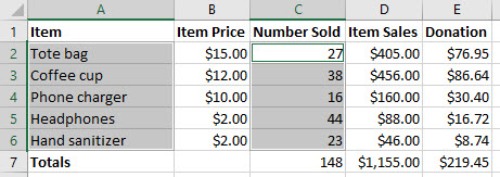
To begin we will need to select the data we want to be included in the chart. In this case, the names of the items and the number of items sold (columns A and C). To select non-contiguous data in Excel, we'll need to hold down the Control key (Microsoft Excel for Windows) or the Command key (Microsoft Excel for macOS) while selecting the data.
Press & Drag A2:A6
In Microsoft Excel for Windows, on the keyboard, press and hold: Control key, Press & Drag C2:C6
In Microsoft Excel for macOS, on the keyboard, press and hold: Command key, Press & Drag C2:C6
The selected cells are highlighted in gray, as seen in the following image:

Now we're ready to create a chart. The chart tools are located on the Insert tab of the ribbon.
Click the Insert tab
Click ![]()
Click 
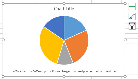
The pie chart appears in the worksheet.

At this point, the chart is pretty basic. However, there are formatting options available. We can customize how the chart looks and what it shows.
NOTE: When a chart is inserted into a spreadsheet, new tabs appear on the ribbon. These tabs, Chart Design and Format, are contextual tabs and provide tools specific to working with a chart. They are only visible when a chart is selected.
While the default pie chart accurately displays our data, we have several formatting options. We can change the color and style of the chart, as well as adjust the amount of information shared.
First, let's add a title to the chart.
Click ![]()
Triple-Click the text "Chart Title"
Items Sold
Click in a blank area of the chart
Now that the chart has a more meaningful name, let's add an element to make the content easier to understand. We'll add data labels. These labels will show the numbers being represented by the pie chart. The Add Chart Element tool is on the Chart Design tab of the ribbon.
Click the Chart Design tab
Click 
Point to Data Labels, Click Data Callout
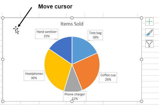
The number, or value, of each item, has been added to each slice of the pie. Using additional options, we could change the font, size, format, or color of these labels. For now, we'll leave them as they are.
With the data labels on the chart, the legend is no longer necessary. Let's remove it.
Click 
Point to Legend, Click None
The pie chart may be covering part of the data in the worksheet. If so, it is easy to move the chart to another area. When moving a chart, it is important to click in a blank area of the chart and to confirm that the move cursor (the four-sided arrow) is being used.

Press & Drag the pie chart below the data
Click a blank area of the worksheet
The chart is now positioned below the data and the data is fully visible.
Graphics, including images and charts, should be given alternative text. This is the text that screen reading software will read aloud to a user who may not be able to see the image. This text should be clear and descriptive and should give the reader an accurate idea of what the graphic conveys. This is especially important when the graphic contains content that is essential to understanding the data.
Let's add alternative text to the chart we just created.
Right-Click the blank area around the pie chart, Click Edit Alt Text...
The Alt Text pane opens on the right side of the worksheet. In this pane, we can add a description of the pie chart.
Click in the description field
Pie chart describing the percentage of sales by item. Hand sanitizer is 15 percent, tote bags are 18 percent, coffee cups are 26 percent, phone chargers are 11 percent, and headphones are 30 percent.
Click ![]()
The alternative text is applied and our worksheet is now accessible to people who utilize screen reading software.
Control key + S