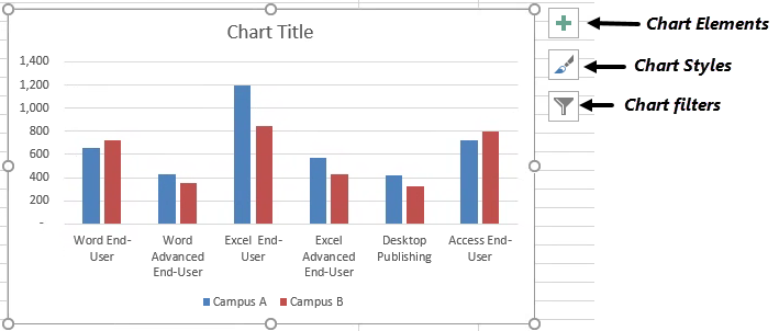
A column chart is probably one of the most common types of charts. Each data point is a vertical column, whose height corresponds to each value. The value scale is displayed on the vertical axis. Any number of data series can be specified, and will typically be displayed in a different color or pattern.
In this section, we will create a column chart and then apply some customizations. First we will switch to the Column Chart worksheet.
Step1. To switch to the Column Chart worksheet,
Click the Column Chart worksheet tab
Charting the Data
The first step in creating a chart is to select the data that we will use for our column chart. The data that we will use for our column chart compares the number of students on two different campuses who have earned a certificate for completing a series of related workshops. When selecting chart data, we must be sure to include items such as labels and series identifiers (row and column headings).
We will select the appropriate range for the chart.
Step1. To select the range for the column chart,
Press & Drag the cell range A2:C8
Step2. Switch to the Insert tab on the Ribbon, if necessary.
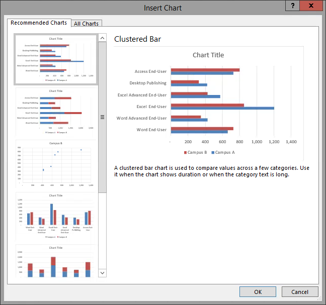
Step3. To choose a chart type, in the Charts group,
Click

NOTE for MacOS Users: This is a gallery which will extend from the Ribbon, not a dialog box. The gallery resembles the left pane of the dialog box shown above, providing a graphic list of the recommended chart types.
Step4. To select a clustered column chart, (the fourth chart in the left pane),
Double-Click the Clustered Column chart

NOTE for MacOS Users: On the Ribbon, with a chart selected, Chart Design and Format tabs appear, but they are not under a parent tab. MacOS users will get to the chart controls and options via the Ribbon and the Menu bar; the three buttons in the image above are Windows-only. The features available in the Chart Elements and the Chart Styles buttons above may be accessed using the Chart Design control tab on the Ribbon.
Step5. To move the chart, if necessary,
Press & Drag the chart below the data
Step6. To display all of the labels horizontally, if necessary,
resize the chart appropriately
Choosing a Different Style
There are several chart styles from which to choose. We can use the Ribbon or the icons to the right of the chart. This time we will use the icons to the right of the chart.
Step1. To choose a different style, to the right of the chart,
Click![]()
NOTE for MacOS Users: To choose a different style, on the Ribbon, Click on the Chart Design tab. Choose a style from the style gallery in the middle of the Ribbon, or Point to a style, and Click on the drop-down arrow which will appear at the bottom center of the gallery to see all available styles at once.
Step2. To choose a style,
Clickany style
NOTE: You can also choose a different style on the Ribbon from the Chart Styles group.
Choosing a Different Layout
Every chart type has several layouts from which to choose. Even though we can manually add elements to a chart, using a predefined layout saves time. A particular layout may contain chart elements such as data labels, axes, title, etc. By choosing an appropriate layout, we may not have to make as many manual adjustments.
We will choose a final layout that places the legend on the right of the chart and a chart title placeholder at the top of the chart.
Step1. To choose a layout, on the Ribbon, in the Chart Layouts group,
Click , Click Layout 1
NOTE: Depending on the style you chose previously, this layout may cause the style to change.
Changing the Orientation of the Data
The chart currently displays six clusters of two data points each. However, we can change the initial orientation of the chart by switching these clusters with the legend series and give the chart a different look.
Step1. To switch the row and column data, in the Data group,
Click
Step2. To switch the row and column data,
Click
Adding a Chart Title
Depending on the type of chart, a chart may have a chart title, a horizontal axis title, and a vertical axis title. However, a pie chart would not have axes titles because it has no axes.
We can replace the default text for any title. However, the chart title or each of the axis titles can use a cell reference. We will use a cell reference and create a link in the chart title so that the chart will always display the text contained in cell A1.
Step1. To select the chart title placeholder,
Click the chart title placeholder
Step2. To position the cursor correctly,
Click in the formula bar
Step3. To begin to create the link to the title text in cell A1, type:
=
Step4. To finish creating the link,
Click in cell A1, press: Enter
NOTE: After you add a title, you can drag it to a different position, but the only way to change the size of a title is to change the font size. However, you can use text boxes, shapes, or callouts to add free-floating text anywhere you want in a chart, which can be resized, moved, rotated, formatted, and so on.
Step5. To save the worksheet, on the Quick Access Toolbar,
Click
Changing the Chart Subtype
Sometimes data can be arranged to emphasize different elements. For example, we can emphasize the total certificate series completed for each campus by changing our column chart to a stacked column chart.
Step1. To begin to change the column chart to a stacked column chart, on the Design tab under Chart Tools,
Click
NOTE for MacOS Users: There is no dialog box displayed here, it is a drop-down menu. Point to Column to see the desired option.
Step2. To change the chart type to a stacked column chart, in the first row,
Double-Click
Displaying a Data Table
Since we adjusted the chart to compare total data across both campuses, we can include a data table to show more specifics.
Step1. To choose a different chart layout, on the Design tab, in the Chart Layouts group,
Click
Step2. To choose a layout, in the middle of the second row,
Click layout 5
Step3. To see the data table below the chart, if necessary,
scroll vertically
Removing the Axis Title Placeholder
We don't need a vertical axis title, so let's remove this placeholder from the chart. This time we will use the Chart Elements button to the right of the chart to disable the Axis Titles checkbox.
Step1. To remove the y-axis title placeholder, at the right of the chart,
Click![]() , Click the "Axis Titles" checkbox
, Click the "Axis Titles" checkbox
NOTE for MacOS Users: To remove the y-axis title placeholder, Click the box for the placeholder on the chart, and press Delete key.
Step2. To close the Chart Elements menu, press:
Esc key
Step3. Deselect the chart.
Step4. Save the workbook ChartData.xlsx.

