Line charts are most effective for showing data that is continuous, usually over time. For example, a chart that showed the value of a stock over the course of a year could effectively be expressed as a line showing the rise and fall of the stock's price. In this case (as is customary with line graphs), the time increments (hours, days, months) would be placed in the chart's x axis, and the value of the stock, in dollars, would be on the chart's y axis. The stock's value would be plotted on the graph as a dot at every intersection between time and value. The points would then be joined by a line which would interpolate (fill in) the values between each data point. The accuracy of the chart necessarily depends on the volatility of the data. Using the stock price example, if the stock price were being charted on a daily basis (every day at closing), and the stock took a nosedive at noon, but rose to its original level by 3:00 pm, that dip would not be registered on a line graph that takes only its data by the stock's closing value.
We will be create a line graph that shows a trend of how many computer materials were ordered for self-study throughout the year. A line chart will give us a little more flexibility in visually displaying the data.
Charting the Data and Adding Elements
Since a line chart can help us spot trends in our data, we want to identify fluctuations over time. In other words, what months are the most common months for students to order computer materials for self-study? The key to creating an effective and accurate chart lies in appropriate data selection.
Let's take a look at the data we will be using.
Step1. To switch to the appropriate worksheet,
Click the Line Chart worksheet tab
Step2. To select the data and appropriate labels for Campus A,
Click cell A2, Shift key and Click cell M3
NOTE for MacOS Users: The Quick Analysis tool is not available in Excel 2016 for Mac. To begin to create a Line chart, Click the Insert tab, Click the Line Chart button. Then you may skip forward to step 5.
Step3. To begin the process of inserting a chart, to the right of the selection,
Click

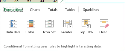
Step4. To select the correct category,
Click Charts
Step5. To select the line chart,
Click
Step6. If necessary or desired, move and resize the chart.
Step7. To add the axes titles, to the right of the chart,
Click![]() , Click the Axis Titles checkbox
, Click the Axis Titles checkbox
NOTE for MacOS Users: In Excel 2016 for Mac, the Axes Title placeholders must be added separately. To add the Horizontal axis title placeholder, on the Chart Design tab, Click Add Chart Element, Point to Axis Titles, Click the Primary Horizontal option. Repeat this procedure to add the Vertical axis title placeholder, using the Primary Vertical option.
Step8. To add a legend,
Click the Legend checkbox
Step9. To move the legend to the bottom of the chart,
Click![]() , Click Bottom
, Click Bottom
Step10. To close the Chart Elements menu, press:
Esc key
NOTE for MacOS Users: To add a legend at the bottom of the Chart Area, on the Ribbon, Click Add Chart Element, Point to Legend, Click the Bottom option.
NOTE: You can also Press & Drag the legend manually to a different location; however, the plot area will not always adjust to accommodate the legend.
Step11. To save the worksheet, on the Quick Access Toolbar,
Click
Changing the Chart Style
We will change the chart style so that the line will display markers at each data point.
Step1. Make certain the chart is selected.
Step2. To begin to change the chart style to a line with markers, to the right of the chart,
Click![]()
NOTE for MacOS Users: To begin to change the chart style to a line with markers, Click the Chart Design tab on Ribbon, if necessary, then choose from the styles gallery in the center of the Ribbon.
Step3. To change the chart style to a line with markers, near the bottom of the Chart Styles gallery,
Click Style 14
Step4. To change the line color, in the Chart Styles pane,
Click Color, Clickany color
NOTE for MacOS Users: To change the line color, press: Control key+Click the line, Click Format Data Series..., Click the Fill bucket icon, and in the Color section of the pane, Clickany color, then close the pane.
Step5. To close the Chart Style pop-out menu, press:
Esc key
Step6. Adjust the placement and size of the chart, if necessary.
Adding Titles to the Chart
We will add a chart title by linking it to the first cell in the worksheet.
Step1. To select the chart title placeholder,
Click the chart title placeholder
Step2. To position the cursor correctly,
Click in the formula bar
Step3. To begin to link the text to cell A1, type:
=
Step4. To link the title to cell A1,
Click cell A1, press: Enter
Step5. To add the horizontal axis title,
Click the horizontal axis title placeholder,
type: Months Enter
NOTE for MacOS Users: The horizontal axis title placeholder already exists. To enter the text for the horizontal axis title, Click the horizontal axis title placeholder, Click in the formula bar, and type: Months Enter.
Step6. To add the vertical axis label,
Click the vertical axis title placeholder,
type: No. of Materials Enter
NOTE for MacOS Users: The vertical axis title placeholder already exists. To enter the text for the vrtical axis title, Click the vertical axis title placeholder, Click in the formula bar, and type: No. of Materials Enter.
Adding a Data Series to a Line Chart
Once a chart is inserted into a worksheet, we have seen that the chart is interactively linked to the data. Furthermore, more data can be added to an existing chart. For example, if we wanted to compare the number of materials that were ordered by another campus, we could simply graph the second campus on the same chart by adding an additional data series.
Step1. Verify that the chart is selected.
Adding a Data Series to a Line Chart in Windows
Adding another data series to an existing chart is relatively simple, using Windows. You will need to specify the following information regarding the new data: the series name, the values to be used for that series, and in some cases, the horizontal axis labels to be used.
By adding another data series, we will be able to visually compare the number of computer materials that were ordered by both Campus A and Campus B.
Let's add another data series to the selected chart.
Step1. To begin to add a data series, to the right of the chart,
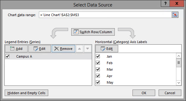
Click![]() , Click Select Data...
, Click Select Data...

NOTE: You can also access this dialog box from the Ribbon on the Chart Design tab, in the Data group.
Step2. To initiate the process of adding a data series, at the left side of the dialog box,
Click

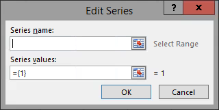
Step3. To move the Edit Series dialog box, if necessary,
Press & Drag the dialog box below the data
Step4. To indicate the proper name for the series, in the Series name field,
Click in the Series name field, Click cell A4,
press: Tab key
Step5. To indicate the set of values for the series, in the Series values field,
Press & Drag cell B4 through cell M4
Step6. To return to the Select Data Source dialog box,
Click
Step7. To begin to edit the horizontal axis labels, in the Horizontal (Category) Axis Labels pane,
Click
Step8. To edit the axis labels, in the Axis label range box,
Press & Drag cells B2 through M2, press: Enter
Step9. To accept the changes and close the Select Data Source dialog box,
Click
Step10. Save the workbook ChartData.xlsx.
Adding a Data Series to a Line Chart in MacOS
Adding another data series to an existing chart is simple, using MacOS. You will need to specify the following information regarding the new data: the series name and the values to be used for that series.
By adding another data series, we will be able to visually compare the number of computer materials that were ordered by both Campus A and Campus B.
Let's add another data series to the selected chart.
Step1. To begin to add a data series, on the chart, press:
Control key+Click the Chart Area,
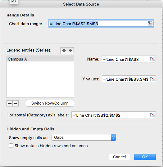
Click Select Data...

Step2. To initiate the process of adding a data series, at the left side of the dialog box,
Click
Step3. To indicate the proper name for the series, in the "Series name" field,
Click , Click cell A4, press: Enter
Step4. To indicate the set of values for the series, in the "Y values" field,
Click , Press & Drag cell B4 through cell M4, press: Enter
Step5. To accept the changes and close the Select Data Source dialog box,
Click
Step6. Save the workbook ChartData.xlsx.

