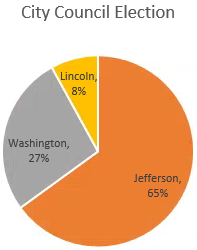
Pie charts show the relative proportion of any part to the whole. This means that a pie chart can only use one data series, and that no value can be a negative number. Pie charts tend to be the most useful when there are a small number of data points since too many data points will make a pie chart difficult to interpret. For example, the pie chart below shows that election poll results could be plotted on a pie chart, with each candidate's percentage of the vote visible as a "slice" of the pie:

Today, we will be using a pie graph to show the different participants who took our computer workshops over a period of six months.
Let's move to the worksheet with the appropriate data.
Step1. To move to the Pie Chart worksheet,
Click the Pie Chart worksheet tab
Charting the Data
The primary characteristic of a pie chart is that it charts one series of data. On this worksheet, however, we have several sets of data; namely, categories of workshop participants who have taken our workshops for six months. Therefore, we will select only the data series we want to chart along with the appropriate labels.
We want to make a pie chart that shows the total workshop participants as parts of a whole. To accurately chart this data, we need to select the data labels in column A, and the total values in column H. We will use the control key to make a non-contiguous, or non-adjoining, selection.
Step1. To begin selecting the appropriate data,
Press & Drag the cell range A3:A8
Step2. To add the Total data to the selection, press:
Control key and Press & Drag the cell range H3:H8
NOTE for MacOS Users: To add the Total data to the selection, press Command key and Press & Drag the cell range H3:H8.
Step3. To begin the process of inserting a chart, on the Ribbon,
Click the Insert tab
Step4. To select the appropriate chart type, in the Charts group,
Click

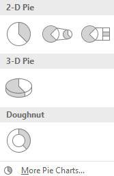
Step5. To select the pie chart, in the first row,
Click
Step6. To move the pie chart below the data,
Press & Drag the pie chart below the data
Step7. Resize the chart to a larger size.
Adding Data Labels
We want to place the data labels inside each piece of pie and also include percentages for each category. We can either use the Add Chart Element button on the Ribbon or use the Chart Elements button to the right of the chart.
We will use the Chart Elements button to the right of the chart to add these chart elements.
Step1. To access the Data Labels options, to the right of the chart,
Click![]() , Point to Data Labels
, Point to Data Labels

NOTE for MacOS Users: To access the Data Labels options, in the Chart Design tab on the Ribbon, Click the Add Chart Element button, Point to Data Labels, Click on More Data Label Options....
Step2. To continue,
Click , Click More Options...

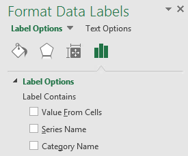
Step3. To view the Label Options, if necessary,
Click![]()
Step4. To expand the Label Options, if necessary,
Click
NOTE for MacOS Users: The list of label options is already visible.
Step5. To add the Category Name,
Click the Category Name checkbox
Step6. To add the percentages,
Click the Percentage checkbox
Step7. To uncheck the Value checkbox,
Click the Value checkbox
Step8. To experiment with different label positions, in the Label Position section,
Click the Center radio button
Click the Inside End radio button
Click the Outside End radio button
Step9. To allow Excel to determine the best placement of labels and percentages,
Click the Best Fit radio button
Step10. Close the Format Data Labels pane.
Removing the Legend
Since the data labels are included within each piece of pie, we don't need a legend. We could also choose to move the legend to a different location, but toggling the legend off is very easy.
Step1. To remove the legend, to the right of the chart,
Click![]() , Click the Legend checkbox
, Click the Legend checkbox
NOTE for MacOS Users: To remove the legend, on the Ribbon, Click the Add Chart Element button, Point to Legend, Click None.
NOTE: You can also select the legend then press Delete keyon the keyboard to remove the legend.
Step2. Save the workbook ChartData.xlsx.
Exploding a Piece of Pie
We can "explode" one or more pieces of pie for emphasis. Let's explode the piece of pie that shows the staff participants.
Step1. To select the Staff slice of pie,
Click the entire pie, Click the "Staff" slice of pie
NOTE: You can verify that only a single slice is selected if just that one slice is bounded by circles at the three intersections.
Step2. To explode the piece of pie,
Press & Drag the slice out from the rest of the pie
Step3. To place the slice back into the pie,
Press & Drag the slice back into the pie
Adding a Secondary Bar Chart
There may be cases where we want to show a further breakdown of a piece of pie. For example, in our pie chart, the General Public and Non-Profit labels don't fit very well within the pie since the pieces are quite small. We can combine these two pieces of pie and then display a secondary bar that provides more detail.
We will show the lesser two pieces of pie as one piece and then show a further breakdown of the general public and non-profit participants by using a secondary bar chart. In order to do this, we must first change the chart type.
Step1. To begin to change the chart type,
Right-Click in the blank chart area, Click Change Chart Type...
NOTE for MacOS Users: To begin to change the chart type, press the Control key+Click in the blank chart area, Click Change Chart Type.., Click the pie chart.
Step2. To select the Bar of Pie, at the top of the dialog box,
Double-Click
NOTE: If Excel uses the incorrect data points for the secondary chart, you can Right-Click any of the pie slices and choose Format Data Series. In the Format Data Series pane to the right of the chart, you can then specify how many of the "last" values should appear in the chart. (The default is 2.) You can also split a series by value or percentage value.
Adding a Chart Title
The last thing we will do with this pie chart is to add a descriptive title. We will link the title to the title of the data as we did in the column chart.
Step1. Select the chart title placeholder, if necessary.
Step2. To position the cursor correctly,
Click in the formula bar
Step3. To begin to link the text in the title to cell A1, type:
=
Step4. To link the title to cell A1,
Click cell A1, press: Enter
Step5. Save the workbook ChartData.xlsx.

