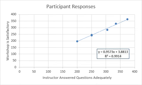
The XY chart, sometimes called a scatter chart, is one of the most commonly used charts for technical data. An XY chart differs from most charts in that it has values along both axes; the data points are the intersections between the two data sets. There is no category axis. This type of chart compares at least two sets of values or pairs of data and is used to show a relationship between sets of values.
Step1. To switch to the appropriate worksheet,
Click the Scatter Chart worksheet tab
Charting the Data
When charting this data, as with any chart, selecting only the desired data is critical to success. We are not always restricted to selecting data from the worksheet with its column labels. Here, we may want to select the values from both columns, but not include the column labels in the selection. The reason for possibly omitting the column labels is we can assign the labels later, in the chart, and use more appropriate text for this chart than those used as column labels. So for this Scatter chart, we will omit the column labels from our selected data.
Step1. To select the appropriate data,
Press & Drag from B3 to C8
Step2. To switch to the INSERT tab, on the Ribbon,
Click the Insert tab
Step3. To select the appropriate chart type, in the Charts group,
Click ,
,
Click the first Scatter chart
Step4. To move the chart, if necessary,
Press & Drag the chart below the data
Adding Titles and a Trendline
This chart needs a descriptive title and axis labels that reflect the purpose of each axis. This type of chart will not need a legend.
Trendlines are used to graphically display trends in existing data and to help predict forecasts of future values. A trendline can be added to any data series in an unstacked, 2-D area, bar, column, line, or scatter chart. The default trendline is linear, and the data points will show an increasing or decreasing line at a steady rate.
Excel calculates such a line based on the experimental data, and adds it to the chart. Essentially, the line expresses the "trend" of the data, and answers the question, "Is the trend favorable or unfavorable?"
We will use a predefined layout to add title placeholders and the trendline. This will save us some steps.
Step1. To choose a predefined layout, on the Design tab, in the Chart Layouts group,
Click
NOTE for MacOS Users: If the chart is selected, the correct command tab on the Ribbon is named the Chart Design tab.
Step2. To choose a layout,
Click Layout 9
NOTE: Since a trendline is a mathematical construction, it can be extrapolated to predict values outside of its data set as well. Essentially, extrapolation estimates the values of a series, and instead of "filling in" the missing data points, it can extend the data forward and/or backward.
Step3. To remove the legend from the chart,
Click the legend, press: Delete key
Step4. To select the chart title placeholder,
Click the chart title placeholder
Step5. To position the cursor correctly,
Click in the formula bar
Step6. To add descriptive text, type:
Participant Responses Enter
Step7. To begin to add the horizontal axis title,
Click the horizontal axis title placeholder, Click in the formula bar, type: =
Step8. To add the horizontal axis title,
Click cell B2, press: Enter
Step9. To begin to add the vertical axis title,
Click the vertical axis title placeholder, Click in the formula bar, type: =
Step10. To add the vertical axis title,
Click cell C2, press: Enter
Step11. To move the equation, with the four-sided arrow cursor,
Press & Drag the equation to the lower right corner of the chart
Step12. To make the equation appear in a bold font style, with the text box selected, press:
Control key+b
NOTE for MacOS Users: To make the equation appear in a bold font style, with the equation text box selected, press: Control key+Click the text box, Click Font... , the Font dialog box opens. In the Font Style drop-down list, Click Bold.
Step13. Change the color of the equation text box font, if desired.
Step14. To display the transparent toolbar,
Right-Click the equation text box
Step15. To change the color of the border of the equation text box,
Click , Clickany color
NOTE for MacOS Users: To change the color of the border of the equation text box, with the equation text box selected, Click the "Shape Outline" tool on the Format tab of the Ribbon.
Step16. Add a fill color to the text box, if desired.
Step17. Deselect the text box.
Step18. Save the workbook ChartData.xlsx.
Adding Vertical Gridlines
Many XY charts have significant numeric data. Thus, being able to see interior gridlines for one or both axes makes the data easier to read.
In this case, we will add vertical gridlines to the chart and remove the minor horizontal gridlines.
Step1. To add major gridlines, to the right of the chart,
Click![]() , Click
, Click ,
,
Click the "Primary Major Vertical" checkbox
NOTE for MacOS Users: To add major gridlines, select the chart, on the Chart Design tab in the Ribbon, Click Add Chart Element, Point to Gridlines, Click the Primary Major Vertical option.
Step2. To toggle off the minor horizontal gridlines,
Click the "Primary Minor Horizontal" checkbox
NOTE for MacOS Users: To toggle off the minor horizontal gridlines, on the Chart Design tab in the Ribbon, Click Add Chart Element, Point to Gridlines, Click the Primary Minor Horizontal option.
Step3. To close the Chart Elements menu,
Click outside the chart area

Adjusting the Horizontal Axis
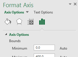
Excel has set the minimum and maximum scale values of the horizontal and vertical axes to 0 in this chart. As a result, we have a lot of "dead space" that can be eliminated.
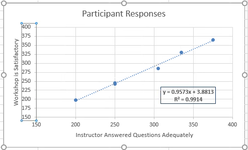
Since we have no values below 200, we will first change the minimum horizontal value to 150.
Step1. Select the chart.
Step2. To begin the process of formatting the horizontal axis, to the right of the chart,
Click![]() , Click
, Click ,
,
Click More Options...
NOTE for MacOS Users: To begin the process of formatting the horizontal axis, on the Chart Design tab in the Ribbon, Click Add Chart Element, Point to Axes, Click More Axis Options...

Step3. Open the Axis options, if necessary.
Step4. To adjust the minimum value, in the Minimum field of the Bounds section,
Press & Drag the Minimum value, type: 150 Tab key
Adjusting the Vertical Axis Minimum Value
Since the vertical axis data don't include any values before 198, we will adjust the vertical axis to begin with the minimum value of 150.
Step1. To select the vertical (value) axis, in the chart,
Click anywhere in the vertical axis
NOTE: If you Click the Format tab, at the far left of its Ribbon, you can easily select or verify that the vertical axis is selected in a drop-down menu. Certain elements of a chart may be easier to select using this drop-down menu.
Step2. To adjust the minimum value, in the Minimum field in the Bounds section,
Press & Drag the Minimum value, type: 150 Tab key
Step3. To change the increment value to 25, under Units, in the Major field,
Press & Drag the value, type: 25 Tab key
Step4. Close the Format Axis pane.

5. Save the workbook ChartData.xlsx.

