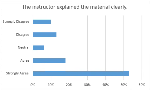
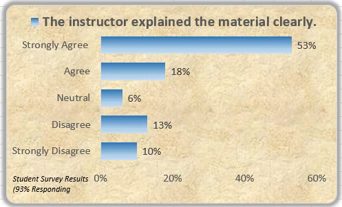
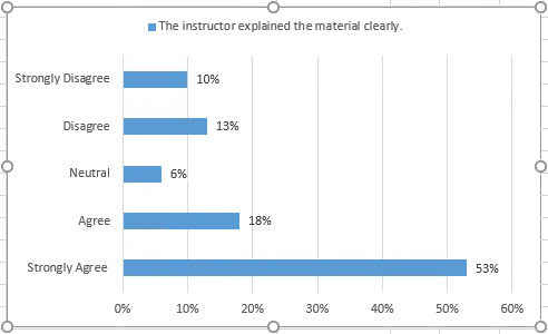
We will explore some advanced chart formatting options by creating a series of charts for the Continuous Education Department in the University of the Midwest. After collecting some survey data from some of the workshops that were offered, we want to present that data in a format appropriate for PowerPoint slides. We will use bar charts to present the results of survey questions about the workshops.
In this section, we will create a bar chart, and then customize it. Once it is formatted as we wish, we can save it as a chart template, so it may be easily reused. Once a customized chart exists as a template, it can be applied to an existing chart, and the formatting will be applied instantly using the new data.This is great way to create a series of similar-looking charts very quickly.
NOTE: This project was inspired by examples used in John Walkenbach's Excel Charts book.
Step1. To switch to the appropriate worksheet,
Click the Survey Data worksheet tab


Charting the Data
First we will create a chart that uses Excel's default values as an embedded chart on the worksheet. We will select the column headings and the first row of data in order to chart the survey responses for "The instructor explained the material clearly." Then later we will create charts for the remaining survey responses.
Step1. To select the correct range,
Click cell A1, press: Shift key and Click cell F2
Step2. To switch to the Insert tab, on the Ribbon,
Click the Insert tab
Step3. To choose a chart type, in the Charts group,
Click
Step4. To choose the first chart,
Double-Click the first bar chart
Step5. Resize the chart so that all of the horizontal axis labels are displayed, if necessary.
Applying a Chart Style
The styles displayed in the Styles gallery depend on the workbook's theme. If we apply a different theme, we will have a different set of styles to choose from.
Next we will change the appearance of the bars on this chart by applying a different style.
Step1. To view the chart styles, to the right of the chart,
Click![]()
NOTE for MacOS Users:To begin to change the chart style to a line with markers, Click the Chart Design tab on Ribbon, if necessary, then choose from the styles gallery in the center of the Ribbon.
Step2. To select a chart style,
Click Style 5
NOTE: From the Format tab on the Ribbon, you can also Click Shape Fill, Shape Outline, or Shape Effects in the Shape Styles group to select the formatting options that you want.
Applying Data Labels and a Legend
We will display data labels for each bar. This will allow the actual values of a particular response to be seen more readily in our PowerPoint slide show.
Step1. To display data labels at the end of each bar, if necessary,
Click![]() , Click the Data Labels checkbox
, Click the Data Labels checkbox
NOTE for MacOS Users:To display data labels at the end of each bar, on the Chart Design tab, Click Add Chart Element, Point to Data Labels, Click the Outside End option.
NOTE: If you have the entire chart selected, data labels will be applied to all data series. If you have a single data point selected, data labels will only be applied to the selected data series or data point.
Step2. To display a legend,
Click the Legend checkbox
NOTE for MacOS Users: To add a legend at the top of the Chart Area, on the Ribbon, Click Add Chart Element, Point to Legend, Click Top.
Step3. To display the legend at the top of the chart,
Click , Click Top
Step4. To remove the title,
Click the title, press: Delete key

5. Save the workbook ChartData.xlsx.
Formatting the Chart Area
Even though we have created the bar chart, there is still much formatting that needs to be done. For example, the background and bar colors can be added or changed to make the chart more visually appealing to the audience.
If we have formatting that should apply to most of the chart, it is often easiest to apply that change to the entire Chart Area, and then format the exceptions.
Step1. To select the Chart Area, if necessary,
Click the outer region of the chart
Step2. To increase the font size, in the Size field,
Right-Click in the chart area (outside of the plot area)
Click Font..., Press & Drag the Size value, type: 12 Enter
NOTE for MacOS Users: To increase the font size, press: Control key+Click the chart area, Click Font... , the Font dialog box opens. Press & Drag the Size value, type: 12 Enter.
Step3. To format the chart area,
Right-Click the chart area, Click Format Chart Area...
NOTE for MacOS Users: To format the chart area, press: Control key+Click the chart area, Click Format Chart Area... .
Step4. To expand the FILL section, in the task pane,
Click , Click the "Picture or texture fill" radio button
Step5. To apply a different texture fill,
Click , Clickany texture
NOTE: A lighter texture fill will be less likely to interfere with understanding the charted data. The screen captures here use the Stationary texture fill.
Step6. To add rounded corners, in the task pane,
Click , Click the "Rounded corners" checkbox
Step7. To add a glow color to the outer border, at the top of the task pane,
Click , Click
 ,
,
Click , Clickany color
NOTE: You can also change the size of the glow and soft edges or increase the transparency, and add border colors, shadows, and 3-D formats.
NOTE: If you want to reset the formatting of a chart element to its original state, just Right-Click the chart element and choose "Reset to Match Style."
Step8. Save the workbook ChartData.xlsx.
Working with the Horizontal and Vertical Axes
We can have a great deal of control over the format, position, and scale of the chart's axes. We can specify the line style, color, and weight of the axes, as well as the presence or absence of tick marks and tick labels, which are related to the axes. We can also establish the positions at which vertical and horizontal axes intersect.
NOTE: Remember that in bar charts, the axes are reversed from column charts; the category axis is the vertical axis.
Step1. To view the axis settings,
Click the horizontal axis
Step2. To display the axis options, at the top of the Format Axis task pane,
Click![]()
Step3. To expand the axis options,
Click
NOTE: Sometimes data can appear distorted or manipulated if the minimum and maximum values are not set appropriately to match the values, especially on line or column charts.
Setting a Fixed Maximum Value for the Horizontal Axis
Step1. To set the fixed maximum value for the horizontal axis, in the Maximum field,
Press & Drag the value, type.6 Enter

Re-ordering the Category Labels
By default, category labels are arranged from bottom to top on the vertical axis because labels are referenced from the 0 reference point (usually the lower left corner of the chart). We will reverse the values on the vertical axis so that Strongly Agree is placed at the top of the axis instead of at the bottom.
Step1. To select the vertical axis, on the chart,
Click the vertical axis
Step2. To reverse the categories on the category axis, beneath the Axis position section of the Format Axis task pane,
Click the "Categories in reverse order" checkbox
Step3. To retain the labels on the horizontal axis at the bottom of the chart, in the "Horizontal axis crosses" section,
Click the "At maximum category" radio button
Step4. Close the Format Axis task pane.

