We're going to use a new dataset about fictional university donors to create a pivot table that tells us the school and major with the highest donations.
We'll begin by moving to the AlumniDonors worksheet and examining the data.
The following files are available for download:
We're going to use a new dataset about fictional university donors to create a pivot table that tells us the school and major with the highest donations.
We'll begin by moving to the AlumniDonors worksheet and examining the data.
Click the AlumniDonors tab
This dataset contains information about university alumni who have made donations to the university. These are one-time donors. They graduated between 2010 and 2015 and made their donation between 2016 and 2020. There is a lot of information about each donor including their University ID, Campus, School, Major, and Graduation year. In addition, we can see the amount the person donated and when that donation was made. The Acknowledgement column tells us if an acknowledgment was sent. And the Emails column shows us how many emails were sent before the person donated.
We will use this dataset to learn which major within each school had the largest donor.
Before we start building the pivot table, we need to turn this dataset into an Excel table.
Click the Insert tab
Click any cell that contains data
Click ![]()
Click ![]()
Click any cell containing data
Click the Insert tab
Click 
Click ![]()
Double-Click the new worksheet tab, type: DonationsBySchool Enter key
With the new worksheet created and named, we're ready to add fields to the pivot table. We'll add the School, Major, and Donation Amount fields.
Press & Drag the School field to the Rows area
Press & Drag the Major field to the Rows area
Press & Drag the Donation Amount field to the Values area
In Microsoft Excel for Windows, Click Sum of Gross Sales, Click Value Field Settings...
In Microsoft Excel for macOS, Right-Click Sum of Gross Sales, Click Field Settings
In Microsoft Excel for Windows, Click ![]()
In Microsoft Excel for macOS, Click ![]()
Click Currency
Double-Click 2, type: 0
Click ![]() , Click
, Click ![]()
This pivot table gives us a lot of information. We can see how much the donations were for each school and each major within the school. Before we sort this pivot table to see the largest amounts, let's change the report layout to Tabular Form and change the name of the Sum of Donation Amount column.
Click , Click Show in Outline Form
Click in cell C3, type: Donations Enter key
With the formatting complete, let's sort the pivot table.
We will sort the donations on two levels. First, we will sort by school with the school with the highest donation at the top. Then we will sort by major within each school.
Click ![]() , Click More Sort Options...
, Click More Sort Options...
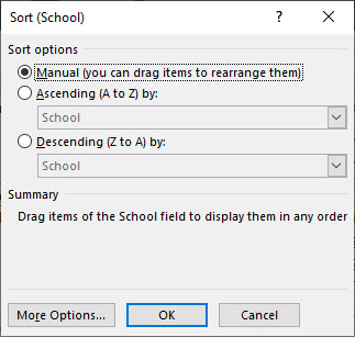
The Sort (School) dialog box opens:

This dialog box gives us options for how we want to sort the School column. We could manually sort by pressing and dragging items where we want them. We can sort in ascending (A to Z) or descending (Z to A) orders. We also have the option to sort alphabetically by school or by donations.
Click ![]()
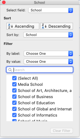
The sorting and filtering options for the School field are visible:

We see the ways we can sort or filter the pivot table. We can sort in ascending or descending order by the School or Donations fields.
Because we want the school with the most donations at the top of the list, we will sort the pivot table in descending order by donations.
Click The Descending (Z to A) radio button
Click  , Click Donations
Click ![]()
Click ![]()
Click![]() , Click Donations
, Click Donations
Click ![]()
The pivot table adjusts and the School of Business with donations of $11,363 is at the top.
It may be difficult to get an accurate idea of the total donations for each school. Let's collapse the School field to show just the totals.
Click ![]()
The pivot table now shows just the schools and donation amounts. The majors are still part of the pivot table. They just aren't visible.
Depending on where your active cell was before the field was collapsed, it may now be outside the pivot table. When this happens, the pivot table field list disappears. Reopening the field list is a simple task.
Click any cell in the pivot table
We can see that the School of Business had the most donations. But what if we want to see the donations each major within the School of Business contributed? We can expand just that entry in the pivot table.
Click ![]()
The entry expands and we can now see all of the majors within that school.
If we want to see all of the majors, it isn't necessary to individually expand the entries. There is a tool that will expand the entire School field.
Click ![]()
Currently, the majors within each school are listed in alphabetical order. Because this pivot table is focused on the donation amounts, it would be helpful if the majors were sorted by donation amount.
Let's add a second-level sort to the pivot table.
As is often the case in Microsoft Excel, there are several ways to begin sorting data. Earlier we utilized the Sort dialog box. For this second-level sort, we will right-click and choose a command from the context menu.
When sorting a pivot table, the sort will stay within the higher field. Therefore, the sort of the Donations field will stay within each school.
Right-click a value in column C, Point Sort, Click Sort from Largest to Smallest
The pivot table is now sorted by School and Major with the donation amount being the criteria for the sort.
When working with pivot tables, it may be helpful, or even necessary, to see the original source data hidden behind the pivot table.
We can see that within the School of Music, Ballet alumni donated $1,655. What if we want to know more about these alumni? Who are they? When did they graduate? How much did each person donate?
Excel makes it easy to get this information.
Double-Click cell C43
A new worksheet opens. It contains the source data for the six Ballet alumni who made donations.
Before we move on, let's name this worksheet and save the workbook.
Double-Click the current worksheet name, type: BalletAlumniDonors Enter key
Click the AlumniDonors tab
Control key + S