The last thing we need to work on is the header for our page. Currently, we only have a heading, lead paragraph, and a Learn More hyperlink:
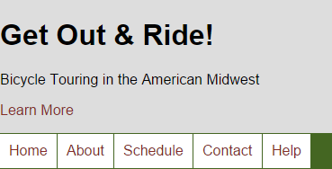
Part of having a functional web page is having an attractive, well-structured header. Some characteristics to look for are:
- a page or site title
- a brief explanation of what your page is about
- a call to action
- good, consistent navigation.
Today, we don't have to do much markup to create the structure for our header, but we do need to make it attractive. Our header has a really simple structure:
<header class="jumbohead">
<h1>Get Out & Ride!</h1>
<p>Bicycle Touring in the American Midwest</p>
<p><a class="button-large" href="about.html">Learn More</a></p>
</header>
Exiting code block.
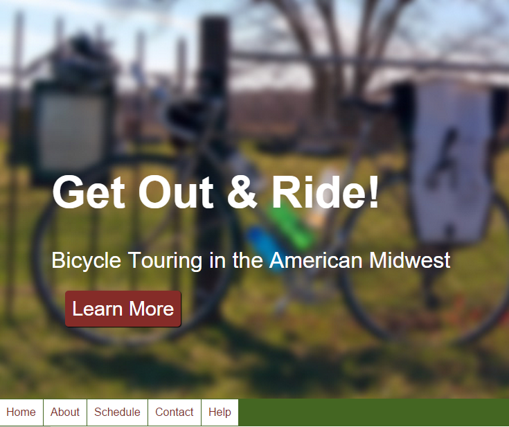
We will be using the .jumbohead and .button-large classes already included in index.html to create a header that looks something like this:
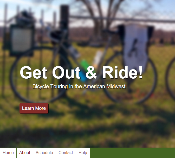
As you can see, the title is large, the lead paragraph sticks out under the title, and the Learn More hyperlink looks like a button, which encourages interaction from the page visitor. Let's start by creating this button.
Creating a CSS Button
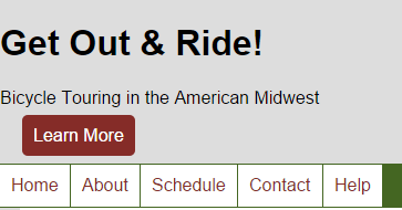
The button we are creating today will have a slight shadow to separate it from the background, rounded corners to make it look more button-like, and some color to make it stand out. Let's start by adding our .button-large class to the CSS file and setting the background, foreground, and text-decoration.
Step1. Activate style.css in the code editor.
Step2. To create the .button-large class, type:
body {
    background: #ddd;
}
.button-large {
    background: #852c28;
    color: white;
    text-decoration: none;
}
Exiting code block.
NOTE: We are using the background shorthand property here. Since color is the only thing we are specifying, we could also have used the background-color property. Both methods are acceptable.
Step3. Save style.css and refresh index.html.
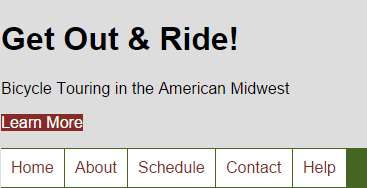
Step4. To add margin and padding to our button, type:
.button-large {
    background: #852c28;
    color: white;
    text-decoration: none;
    padding: 10px;
    margin: 20px;
}
Exiting code block.
Step5. Save style.css and refresh index.html.
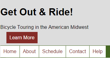
Using the Border-Radius Property
We can curve the edges of a box with the border-radius property. The border-radius property works like this:

If we are setting a value of 2px for the border-radius property, the browser renders that as shown above:
- Box without any border-radius property.
- Draw a 2px circle within the confines of the corner of the box.
- Snip out the right-angle border outside the circle.
- Remove the circle to reveal a 2px-border radius.
The border-radius property can also be used to create elliptical or angled corners, but today, we're just going to round off the corners.
Let's do this to our button now.
Step1. To create a rounded rectangle, type:
.button-large {
    background: #852c28;
    color: white;
    text-decoration: none;
    padding: 10px;
    margin: 20px;
    border-radius: 5px;
}
Exiting code block.
Step2. Save style.css and refresh index.html.
Using the Box-Shadow Property
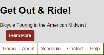
The box-shadow property allows us to add a shadow of a specific color and opacity to an element box on our page. This generates a 3D effect using only CSS. Let's look at the box-shadow property more in-depth now.
The basic syntax for the box-shadow property requires four values:
box-shadow: horizontal-offset vertical-offset blur-radius color;
Exiting code block.
For example:
box-shadow: 14px 7px 3px #343434;
Exiting code block.
The previous code will produce a box shadow that looks similar to the following image:

As you can see from the image, the blur radius determines how close the blur gets to the element's bounding box. Another way of thinking of this is that the browser will create a 3px blur at the edge of the box shadow.
Let's change things up a little bit to see how each of the values relates to each other. Imagine the same box, but with the following box-shadow properties now:
box-shadow: -5px -5px 8px #343434;
Exiting code block.
This generates a box with a shadow similar to this:

As you can see, positive values move the shadow down and right and negative values move the shadow up and left. We want to use the box-shadow property to generate a shadow to help the button appear to be slightly three dimensional.
Let's style our button's shadow now.
Step1. To add the box-shadow property to our button, type:
.button-large {
    background: #852c28;
    color: white;
    text-decoration: none;
    padding: 10px;
    margin: 20px;
    border-radius: 5px;
    box-shadow: 1px 1px 1px black;
}
Exiting code block.
Step2. Save style.css and refresh index.html.
Setting a Background Image
In HTML5 & CSS: The Basics, we set a repeating background image for our page header. Today, we will use a different technique: a single image that covers the entire element's area. Covering is a technique that allows us to have an image that fills the background of the header regardless of the size of the browser's viewport. Let's start by adding the background image to the <header> element.
Step1. To add the background to .jumbohead, type:
body {
    background: #ddd;
}
.jumbohead {
    background-image: url('../images/header_bg.jpg');
    background-size: cover;
    background-color: #eee;
}
Exiting code block.
Step2. Save style.css and refresh index.html.

Step3. To add padding to .jumbohead, type:
.jumbohead {
    background-image: url('../images/header_bg.jpg');
    background-size: cover;
    background-color: #eee;
    padding: 200px 75px 80px 75px;
}
Exiting code block.
Step4. Save style.css and refresh index.html.

Formatting the Title and Lead Paragraph
Since we want the text of both the title and lead paragraph to pop off of the background, we will be using two different properties. First, let's make the font much larger.
Step1. To increase the font size, type the text shown in bold below:
.jumbohead {
    background-image: url('../images/header_bg.jpg');
    background-size: cover;
    background-color: #eee;
    padding: 200px 75px 80px 75px;
    font-size: 200%;
}
Exiting code block.
Step2. To set the color of the .jumbohead text to white, type:
.jumbohead {
    background-image: url('../images/header_bg.jpg');
    background-size: cover;
    background-color: #eee;
    padding: 200px 75px 80px 75px;
    font-size: 200%;
    color: white;
}
Exiting code block.
Step3. Save style.css and refresh index.html.
Step4. To add a shadow around the text, type:
.jumbohead {
    background-image: url('../images/header_bg.jpg');
    background-size: cover;
    background-color: #eee;
    padding: 200px 75px 80px 75px;
    font-size: 200%;
    color: white;
    text-shadow: 2px 2px 2px black;
}
Exiting code block.
Step5. Save style.css and refresh index.html.

Step6. To adjust the size of the button and the lead paragraph, type:
.jumbohead {
    background-image: url('../images/header_bg.jpg');
    background-size: cover;
    background-color: #eee;
    padding: 200px 75px 80px 75px;
    font-size: 200%;
    color: white;
    text-shadow: 2px 2px 2px black;
}
.jumbohead  p {
    font-size:.67em;
}
Exiting code block.
Step7. Save style.css and refresh index.html.
