We explored some simple positioning in the previous workshop, HTML5 & CSS: The Basics. Today, we'll explore positioning a bit more by centering the content on our page.
Centering the Main Content
Centering content is a common task and often people ask how it's accomplished. Recall the discussions of the box model in the previous workshop. We can determine how wide we want the content to be, then set the dimensions for that content box (and its padding & margins) to permit resizing margins to appear on the left and right.
We already have some structure in our page that contains our page's main content:
<div id="main-wrapper">
    <article id="main" class="main_content">
        <section class="question-list">
        <h1>Frequently Asked Questions</h1>
            <ul>
                <li><a href="#tour">What is a bicycle tour?</a></li>
                <li><a href="#gear">What gear do I need to have and what gear does GOAR provide?</a></li>
                <li><a href="#beginners">Do you offer trips for beginning tourists?</a></li>
                <li><a href="#distance">How far do tourists ride each day?</a></li>
                <li><a href="#housing">What evening accommodations should I expect?</a></li>
                <li><a href="#training">How should I prepare for a tour?</a></li>
            </ul>
        </section>
<...><!-- Some Code is omitted in this example -->
    <aside class="sidebar">
        <h1>Don't see your question?</h1>
        <p>If you don't see your question here, you can send us an email or give us a phone call. </p>
        <ul>
            <li>email: <a href="mailto:tourhelp@getoutandride.com">tourhelp@getoutandride.com</a></li>
            <li>phone: 812-555-4627</li>
        </ul>
        <p>You can also send us an email by filling out the following form:</p>
    </aside>
</div>
Exiting code block.
The rule we create will target the #main-wrapper id since it identifies our main content. Let's create this now.
Step1. Make sure style.css is active in the code editor.
Step2. To create the rule to center our main content, type the code shown in bold below:
.main_content {
    padding: 15px;
    background-color: white;
}
#main-wrapper {
    width: 90%;
    margin: 0 auto;
}
Exiting code block.
Step3. Save style.css and refresh index.html.

4. Resize the browser window to see how the margins react now to varying widths.
Creating Columns with Floats
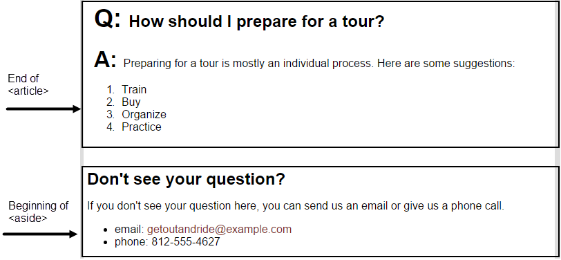
We have two main pieces of content within our <div id="main-wrapper"> in an <article> element that contains the entirety of our FAQ and an <aside> element that has our sidebar information. We can use floating to turn these into two columns rather than stacking one on top of the other as it is now:

We just need to set a width for each container then determine a floating direction - left, right, or none.
Let's add our floating now.
Step1. To float our main content to the left, type the code shown in bold below:
.main_content {
    float: left;
    width: 65%;
    padding: 15px;
    background-color: white;
}
Exiting code block.
Step2. To float our sidebar to the right, type the code shown in bold below:
.sidebar {
    float: right;
    width: 30%;
    padding: 5px;
    background-color: white;
}
Exiting code block.
Step3. Save style.css and refresh index.html.

Clearing Floating Values to Position the Page Footer
Floating an element removes the element from normal document flow. This causes everything else around the floated content to shift. The page structure we see now is this:

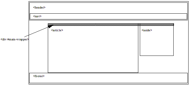
You see that the page's alignment isn't quite what we expect. The <footer> element essentially extends from below the navigation to the bottom of the page. Since the footer is so large, it encompasses the <article> and the <aside> elements regardless of them being children of the <div> element and not the <footer> element. Also, notice that the <divid="main-wrapper"> element has been reduced to the small gray bar highlighted above. This is because, since the <article> and <aside> elements are floated, <divid="main-wrapper"> doesn't have any visible content. It's essentially invisible to the user. What we would like to see instead is this:

As you can see, <divid="main-wrapper"> is collapsed still, but <footer> appears below our floated content. Essentially, we want to tell <footer> to be rendered below any floated item. This is done by setting the clear property. The clear property indicates to what side of an element floated content is not allowed to appear. Clear can take one of the following values:
| Clear Value | Effect on Content |
|---|---|
| left | Floated content is not rendered on the left of the cleared element. Floated content can be rendered on the right of the cleared content. |
| right | Floated content is not rendered on the right of the cleared element. Floated content can be rendered on the left of the cleared content. |
| both | Floated content is not rendered on either side of the cleared element. |
Let's tell our footer to not allow floated items on either side, essentially pushing the footer to the bottom of our page content.
Step1. To disallow floated elements on either side of our footer, type the code shown in bold below:
footer {
    background-color: white;
    margin-bottom: 0;
    padding: 0 3%;
    border-top: 1px solid #462;
    width: 100%;
    clear: both;
}
Exiting code block.
Step2. Save style.css and refresh index.html.

NOTE: If your browser window is too narrow to show the entire <divid="main-wrapper"> element, the <aside> element will be rendered below the <article> element.

