A grid system is a tool that a designer can use to create a more consistent and more robust positioning system to facilitate site design. Grid systems are usually used in responsive sites as they give the designer flexibility to determine how content is arranged and displayed on many different screen sizes.
To create a grid system, a designer creates a series of classes that, when combined, create a table-like presentation of the page's content. It's important to note that we are not using table markup here. Tables are reserved for displaying tabular data, like a course listing or an inventory list. Grids, on the other hand, are created using the <div> element. Since the <div> elements carry no semantic weight, screen readers ignore them when reading back content. This allows us to maintain the accessibility of our page while creating appealing visual structure. This is also why it is important to design for smaller screens first. By designing for a smaller screen first, we create a meaningful flow to the content of our page. That flow is how a page will be read using a screen reader.
Grid systems come in many sizes. Today, we will be creating a six-column grid system. Since our content is relatively simple, six columns will give us enough flexibility to make our page look the way we would like.
The grid we create today will look like this:
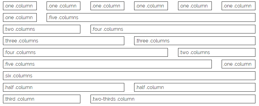
The previous graphic illustrates how the grid system can be used to create a table-like appearance.
NOTE: The classes .half, .third, and .two-thirds refer to one half, one third, and two thirds of the available columns in the grid.
Let's break down one of the rows here and examine the markup:
<div class="container">
    <div class="row">
        <div class="one column">
            .one .column
        </div>
        <div class="five columns">
            .five.columns
        </div>
    </div>
</div>
Exiting code block.
There are a lot of things going on here. First, there is a parent class called .container. Typically, this wrapper is optional, but it sets up some margin on either side of the grid. Each .row container identifies one horizontal section of the grid able to be divided into a maximum of six columns. The next two divisions represent the cells in the row. Each division has two classes applied; the first determines the width of the cell and the second applies a set of style rules to each cell to make it behave like a table cell. The cells show up side-by-side because the .column(s) classes float all content to the left.
Defining Grid Width & Positioning Properties
Let's begin building our grid system by modifying the container class. Based on the discussion earlier, we know that the container class allows us to have some spacing on either side of our grid if we want. Currently, the container class is the following:
.container {
 width: 100%;
 margin: 10px auto 25px;
 padding: 0 20px;
}
Exiting code block.
There are a few ways that we can create the space we discussed earlier. The first is by setting the width property to be a static value. While this would work for the desktop and perhaps the tablet view, it would leave mobile devices users trying to read super-microscopic text on an already tiny screen.
Instead, we can set a maximum width using the max-width property. This method allows the content to flow appropriately on smaller screens, but limits its width on larger ones so that the layout of our site isn't lost. We want to leave the width of the container as 100%, but also create a max-width property with the value 1024px. Let's add this now.
Step1. If necessary, activate htmsw.css in the code editor.
Step2. To add a maximum width to our site, scroll up in the style sheet and type the code in bold below [Region 8]:
.container {
 width: 100%;
 margin: 10px auto 25px;
 padding: 0 20px;
 max-width: 1024px;
}
Exiting code block.
Step3. To add positioning to the container class, type the code in bold below [Region 9]:
.container {
 position: relative;
 width: 100%;
 margin: 10px auto 25px;
 padding: 0 20px;
 max-width: 1024px;
}
Exiting code block.
Step4. Save htmsw.css and refresh index.html.
Changing Box Size Calculations
The last thing we need to do to help set up our grid system is work with the box-sizing property. Recall from HTML5 & CSS: The Basics, the box model looks like this:
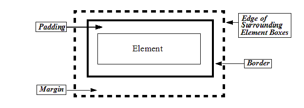
By default, the box model in a page does not take into account the width of a margin or a border when calculating the element's width. Consider the following properties for a box:
.box {
 width: 500px;
 border: 3px solid black;
 padding: 10px 50px;
 margin: 20px 40px;
}
Exiting code block.
This would create a box that is drawn 500px wide, but has an additional 106px in width ((3px border + 50px padding) * 2 sides) and 26px in height ((3px border + 10px margin) * 2 sides). This means the element's actual dimensions are 606px wide and an additional 26px tall.
Since we're creating a precise grid system, we want to have the border values calculated into the full width of an element. This is accomplished using the box-sizing property. This property allows us to change the way a web browser calculates box sizes. The property can have the following values:
| box-sizing value | description |
|---|---|
| content-box | Default. Padding and border are not included in calculating the width or height (or max/min width and height) of an element. |
| border-box | Includes both border and padding in the calculation of box width and height (or max/min width and height), but not margin. |
| initial | Sets the property to the default value. |
| inherit | Uses the same value as the element's parent. |
By adding the border-box value to the box-sizing property, we can ensure that the same code as before generates a box that is 500px wide total:
.box {
 width: 500px;
 border: 3px solid black;
 padding: 10px 50px;
 margin: 20px 40px;
 box-sizing: border-box;
}
Exiting code block.
Here is a graphical representation of border-box and content-box values are rendered:
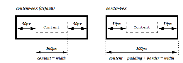
Notice that content-box does not include the width of the border or padding in its calculations while border-box does. It is typical for grid systems to use border-box as it ensures that the grid can be consistent and uniform while allowing different border and padding values to be used in individual cells.
Let's add this to our container class now.
Step1. If necessary, activate htmsw.css in the code editor.
Step2. To set the box-sizing property for our container class, type the code in bold below [Region 10]:
.container {
 position: relative;
 width: 100%;
 margin: 10px auto 25px;
 padding: 0 20px;
 max-width: 1024px;
 box-sizing: border-box;
}
Exiting code block.
Step3. Save htmsw.css and refresh index.html.
Determining the Grid Column Sizes
Before you start creating columns in your grid you first need to plan out how wide the columns are going to be. This sounds like a complicated process, but it's really rather simple. To figure this out, all you need to know is how much space you want between each column and how many columns you would like to use.
To make calculations simple, let's say we want to have a 6-column grid, with about 2 units of space between each column. Again, for simplicity, let's say that the grid will be a total of 100 units wide. This means that the 6 columns and the 2 units of space between them all need to fit within 100 units. The following diagram shows how this would look:
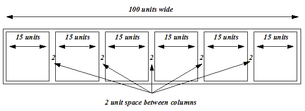
Looking at the previous diagram, after the total of 10 units of space between columns is subtracted, the six columns must come from the remaining 90 units, or 90 / 6 units, or 15 units wide per column. This is the basis for how to determine the sizes of each combination of columns. For example, two columns would be 15 + 2 + 15 or 32 units.
For the more mathematically inclined:
Where:
- W is the total width of the grid
- N is the number of columns
- S is the space between columns
- C is the width of a single column
Since we want to know what the width of a single column is, let's solve for C:
Let's say that for our site today, we want to have a 100-unit wide grid of six columns with 4 units of space between them. The formula for us would then be:
So we see that C = 13.333 units.
Let's start putting together our grid system by defining a new media query for large screen display and adding the classes to create the space between our columns.
Step1. If necessary, activate htmsw.css in the code editor.
Step2. To begin the media query, type the code in bold below [Region 11]:
/* Begin Media Queries to fit other screens starting with tablet-ish sized screens */
@media screen and (min-width: 400px) { /* For devices larger than 400px */
 .container {
  width: 80%;
  padding: 0;
 }
}
@media screen and (min-width: 550px) { /* For devices larger than 550px */
 .container {
  width: 90%;
 }
}
Exiting code block.
Step3. To create the.column and.columns classes, type the code in bold below [Region 12]:
@media screen and (min-width: 550px) { /* For devices larger than 550px */
 .container {
  width: 90%
 }
 .column,
 .columns {
  margin-left: 4%;
  padding: 4px;
 }
}
Exiting code block.
Step4. To remove the margin from the left of the first column within a container, type the code in bold below [Region 13]:
@media screen and (min-width: 550px) { /* For devices larger than 550px */
 .container {
  width: 90%
 }
 .column,
 .columns {
  margin-left: 4%;
  padding: 4px;
 }
 .column:first-child,
 .columns:first-child {
  margin-left: 0;
 }
}
Exiting code block.
NOTE: This can also be accomplished by setting a margin-right for the spacing and then removing the margin-right from the last column in a container by using the last-child pseudo-class.
Step5. Save htmsw.css.

- T is the span width
- N is the number of columns to span
- S is the space between columns
- C is the width of a single column
| CSS Selector | N - Columns to Span | T - Span Width |
|---|---|---|
| .one.column | 1 | 13.333% |
| .two.columns | 2 | 30.667% |
| .three.columns | 3 | 48% |
| .four.columns | 4 | 65.333% |
| .five.columns | 5 | 82.667% |
| .six.columns | 6 | 100% |
| .half.column | 3 | 48% |
| .third.column | 2 | 30.667% |
| .two-thirds.column | 4 | 65.333% |
Step6. To add the column spanning rules to the media query, type the code in bold below (each fraction is carried out 10 places) [Region 14]:
 .column:first-child,
.columns:first-child {
margin-left: 0;
}
.one.column {
width: 13.3333333333%;
}
.two.columns {
width: 30.6666666667%;
}
.three.columns {
width: 48%;
}
.four.columns {
width: 65.3333333333%;
}
.five.columns {
width: 82.6666666667%;
}
.six.columns {
width: 100%;
}
.half.column {
width: 48%;
}
.third.column {
width: 30.6666666667%;
}
.two-thirds.column {
width: 65.3333333333%;
}
}
Exiting code block.
Step7. Save htmsw.css.

Adjusting the Rows of the Grid
Since the grid will allow us to set up rows and then define the columns in those rows, it would be helpful for us to make some minor tweaks to the row class.
As a reminder, the code used to create a row within our grid is similar to this:
<div class="container">
    <div class="row">
        <div class="one column">
            .one.column
        </div>
        <div class="five columns">
            .five.columns
        </div>
    </div>
</div>
Exiting code block.
Remember that each row contains any number of columns. To make the rows behave as expected, i.e. like a row in a table, we need to make a .row class. Since this class will effect all of our layouts (mobile, tablet, and desktop), we want to include it outside of our media queries.
Let's add the .row class now.
Step1. To create the .row class, at the top of htmsw.css, type the code in bold below [Region 15]:
.container {
 position: relative;
 width: 100%;
 margin: 10px auto 25px;
 padding: 0 20px;
 max-width: 1024px;
 box-sizing: border-box;
}
.row {
 box-sizing: border-box;
 margin-bottom: 10px;
}
Exiting code block.
Step2. Save htmsw.css.
Adjusting the Columns of the Grid
You may have been wondering to yourself, "How are we going to make the columns line up horizontally?" The answer to that question is to float them all to the left. This means that the first columns defined in a row will appear to the left and all subsequent column will be floated along the same row. We also want to make sure that each column is taking up the entire width of the window on smaller screens and that it behaves like every other element of our grid with respect to width and height calculations.
Let's write our .column(s) classes now.
Step1. To adjust the behavior of each column, type the code in bold below [Region 16]:
.row {
 box-sizing: border-box;
 margin-bottom: 10px;
}
.column,
.columns {
 width: 100%;
 float: left;
 box-sizing: border-box;
}
Exiting code block.
Step2. Save htmsw.css.
Automatically Clearing Floats
At the end of each row, we want to automatically clear any sort of floating that has been applied. This allows for the rows to stack vertically in the site, creating a two-dimensional grid. This is accomplished by adding some CSS to the :after pseudo-class for the .container and .row classes. Since we want this clearing to override any other :after pseudo-class for .container and .row, we want to add it at the very bottom of our style sheet.
Step1. To create the auto clearing CSS, at the end of the style sheet, type the code in bold below [Region 17]:
/* Clearing
––––––––––––––––––––––––––––––––––––––––––––––––––*/
.container:after,
.row:after {
 content: "";
 display: table;
 clear: both;
}
Exiting code block.
Step2. Save htmsw.css.

