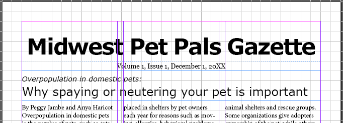
Creating a frame for an article's headline
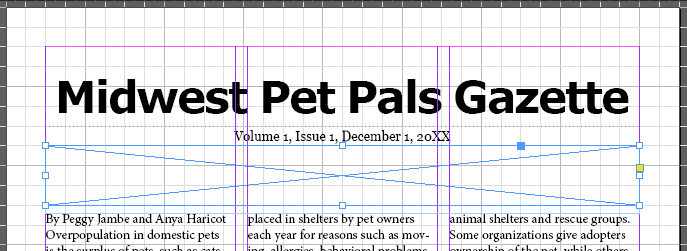
As you've likely already noticed, the main article for our newsletter doesn't have a headline. Since we want the headline to be right underneath the nameplate, we'll need to use the Rectangle Frame tool to make this text frame, since the frame will end up overlapping the columns of text.
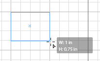
So far, we've used the grid and the rulers to help us size the text frames we create — however, that's not the only tool available to us as we create frames. When creating frames previously, you may have noticed a tooltip appear next to your cursor that looked similar to the following:

This tooltip tells us the exact dimensions of the frame we're creating, and appears when creating a frame with both the Type tool and the Rectangle Frame tool. If we already know the specific size we want a frame to be, we can use the tooltip to help us create a frame of the appropriate size. For the headline, we want a text frame that's 0.75 inches tall and 7.5 inches wide — as we're creating the frame, let's use the tooltip to help us make sure it's the size we need.
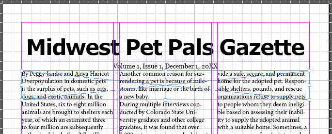
The newsletter should look similar to the following at this point:

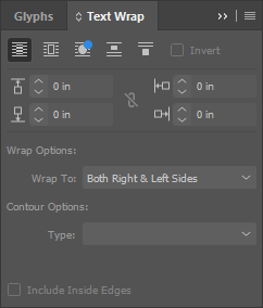
We have a similar problem to the one we had earlier, when the text flowed over the nameplate. While we could resize the columns of text again to move the column tops underneath the headline, there's another way to move the text out from under this frame.


