Choosing colors — whether for web graphics, print graphics, or for general use on the web — can be a tricky process. Not only do you need to think about the mood you're trying to set for a specific graphic or document, you'll also need to be aware of accessibility concerns with color. Let's learn about how to choose accessible colors, resources for creating a color scheme, then we'll explore how to check to see if our chosen colors have sufficient contrast.
NOTE: To learn more about the process of choosing colors to evoke a specific mood, read the section Working with Color from the course Page Design & Layout Basics.
Color and accessibility
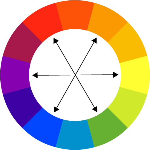
When creating graphics from scratch, especially graphics that include text, you'll want to ensure that there's sufficient contrast between the colors you've chosen for your layout and graphics to make sure they're accessible to those who may have vision impairments. Contrast refers to the difference in colors that helps make them distinguishable from each other. On a color wheel, complementary colors — or, colors that are directly across from each other — are considered to be highly contrasting colors. When choosing colors for a color scheme, think about how well your chosen colors will stand out from each other, especially when used together in an image.
The following color wheel diagram has arrows pointing between pairs of complementary colors, to help you get an idea of colors that have high contrast when paired together.

When determining a color scheme, you don't have to do it on your own — there are a number of resources that can help you choose colors for graphics and websites.
Tools for choosing colors
Creating a color scheme can be a daunting task, but there are tools available to help make the process easier. Color scheme designer sites like Adobe Color and Paletton allow you to create color schemes based on different color rules — in other words, formulas for designing color palettes that result in harmonious color combinations. You can use the Triad or Complementary color rules to create color schemes with constrasting colors.
Following is a list of different color scheme designer sites that can help you choose a color scheme:
- Paletton, which focuses on creating color schemes for websites, and also offers the ability to see how colors look under certain forms of color-blindness
- Adobe Color, which assists in creating color schemes for both print and web documents
- COLOURlovers, which offers a collection of premade color palettes as well as the ability to create your own palette
There are also tools available that can help you ensure the colors you use in your graphics are accessible.
Checking accessibility of colors
Once you've chosen your colors, you'll need to make sure the colors you use won't cause issues for those with vision impairments. This involves checking how well the colors you've chosen contrast each other, and might also involve checking to see how an image might appear to someone with color blindness. Before using colors in a graphic, print layout, or website, you should always check to make sure that there's appropriate contrast between the colors, especially between colors used for the background and text, to ensure that graphic elements stand out from each other. When checking how well colors contrast, you'll want to ensure you have a contrast ratio of at least 4.5:1 for text, and 3:1 for large text and graphics. Sites that check color contrast will display the color contrast ratio for the colors you're checking.
The following list details some web sites that can help you make sure your graphics are accessible, which will help ensure those with vision impairments can see the content in our images:
- WebAIM Color Contrast Checker, which provides detailed information about how well colors contrast each other
- Coblis - Color Blindness Simulator, which allows you to upload an image and see how it might look under different color blindness scenarios
For more information on ensuring proper color contrast, read the IU Knowledge Base article on color contrast.
(not sure if I'm keeping this next part -bln)
Let's practice checking the contrast between some example pairs of colors. We'll use the WebAIM color contrast checker to do this. The pairs of colors we'll be checking are as follows:
- Pair one: #0000FF and #FF00FF (blue and pink)
- Pair two: #800080 and #FFFF80 (purple and yellow)
The WebAIM site will indicate whether a pair of colors has sufficient contrast to be used for text, large text, and graphics or user interface elements. Let's go ahead and test these color pairs now.

